Man, I had some real trouble today. I was trying to figure out what I should work on and I found this image which I thought was cool and inspiring:
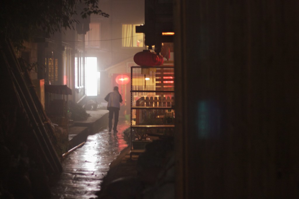 |
| "Longsheng Mountain Village" by tuchodi from Flickr |
|
So I thought "Yeah that could be awesome, it's already a really cool image to begin with!"
False. Either I got overly ambitious or I just wasn't in the right mood for it, but I couldn't get it working at all. I actually included the image above just to highlight how badly I didn't get it. Heh. Really it's ok, I'm trying to expand what I can do through practice so it's never really a failure, but it can be disappointing to fall short of what is in your head.
To be clear: I was not trying to copy the above image. I just was inspired by it in a lot of ways. There's a lot that is similar to it in my final piece, but I didn't go in with the attitude of trying to copy it. I like to keep an open mind about adding elements, etc.
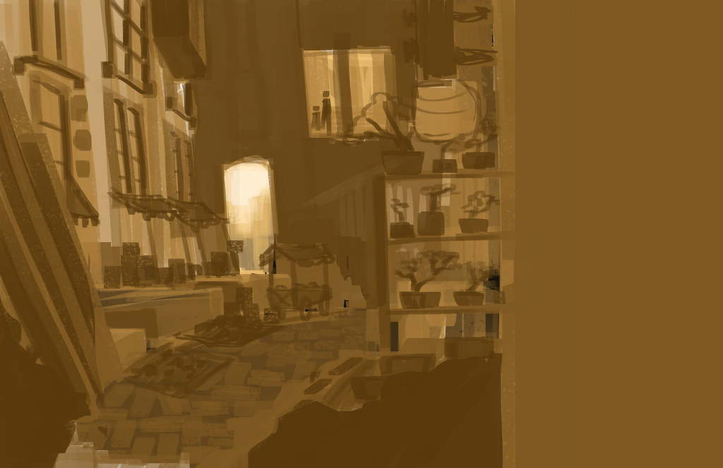 |
| My under map of the image |
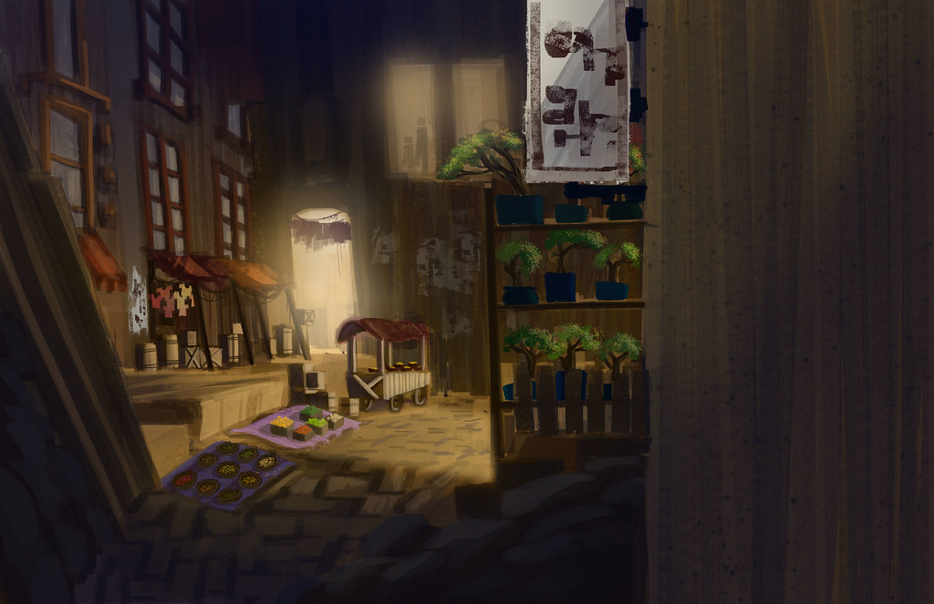
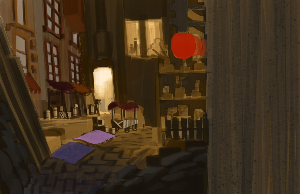 |
| I decided to turn it into a market, started adding color |
 |
| Starting to run into some composition issues. Also... so much brown. |
This is starting to remind me of that song "Golden Brown" by the Stranglers. Except there was frowning by this point. Lots of frowning. The way that I placed the lamps was a) creating a crappy focal point and b) creating a crappier tangent with the bonsai trees. Also did I mention how much brown there is?
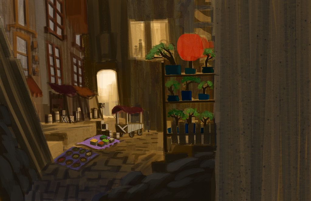
 |
| Come rescue me lighting effects! |
Through gradients and lighting I mitigated some of the incredible amounts of brown. I tried playing with hue but frankly every other color was ridiculous looking. If I had more time (as it was I went about a half hour over my 3 hour goal) I might have played with some masks or something to adjust the colors.
Let's be honest. I don't like how this turned out. Lessons I learned: paint your background before your foreground elements in the planning stage. You'd think this would be obvious, but apparently I am a moron. Laying out the foreground elements and keeping them visible at the beginning really threw me off as I tried to work back into the image. Another thing is I'm thinking if I am going to lay the first layer out in monotone then I shouldn't use one of the core colors that will be in the finished piece. It just makes things confusing. Finally... it was a lot to bite off for three hours when I've been at this only a few days. Tents and carts and baskets... I salvaged some of it, but right now I'm too annoyed to look at it properly. Maybe I'll feel differently tomorrow.
Oh the T-shirts are super cute, also the spices! Oliver would be proud.
ReplyDeleteTHERE MUST BE MORE ADORABLE DETAILS!! It's cute but is it THE CUTEST?!
ReplyDelete