Monday, November 14, 2011

More 3 hour painting

I love reddit. I have to be careful about going there, because it's a ridiculous black hole for productivity, but it can also be a great resource. There are subreddits for all kinds of interesting photos such as interiors, abandoned buildings, nature scenes and a lot of other incredible things.

I recently was rooting around in there when I found this national geographic cover:


I was really inspired, so I decided to do a painting of it:

It took two and a half hours. I'm pretty pleased with the end result. It's not exactly the same, but for the time spent I think it came out all right. I might revisit it later on and do some more with it.

The Warden Commander

I did a drawing recently of my grey warden from Dragon Age Origins. I don't do a lot of fan art, because I don't think it serves well for portfolio pieces, but I've always loved the scene where the human noble origin catches up with the man who murdered his/her family. It's a very cool story filled with high emotions, so I thought it was be a good scene to try illustrating.

I'm really working on perspective, so I started with the main characters:
Just flat coloring to start, trying to get a sense of what colors I think would look good. I used a variety of references, as well as making up the things I thought would look cool. One of the things I love about concept art and illustration is being able to work with pre-existing concepts and pushing them to be as exciting or inspiring as possible. I'm glad I live alone, posing in front of a mirror with my swiffer to try and get the pose of whipping in a circle would have been pretty ridiculous with an audience.

I just added this to show how it took me a while to figure out what sort of background was right. I initially intended to do the scene in a dungeon, because that is where it is set in the game. However, I ended up deciding to go with a different location that I thought would be more interesting.


I set it in a chantry. It was fun making a variety of details and playing with light. I chose a chantry a) because it seemed like a cool place for a fight, but b) there is a lot of architecture to make my life miserable with perspective. Since I'm trying to push myself to sort things out, this was a good opportunity. The shadows here are wildly inaccurate.


Continuing to futz around. I made the table into a pew and that seems more natural for the setting. Messing with the shadows, but they still don't feel right. Other issues are that even though Howe is flying through the air, he still feels very close to the Warden. Since she's not traveling backwards, that just doesn't work. Also the windows behind her are behaving like they are on a flat wall, not on an elipse.


You're never really finished with something, you just have to decide when to throw in the towel. I adjusted Howe to make it look like he's really moving toward the viewer. I mapped the shadows from the light source and found that the reason they looked so wrong is from this angle you can't actually SEE his shadow at all. It looked a little odd, but I can't argue with math. I also fixed the windows, which is a relief to my eyes.

Overall I like it. I want to push harder to use less line in my work though, so I am disappointed in myself for falling into old habits. Must keep trying!

Thursday, November 3, 2011

Recent Work

I've been so busy with class and side projects lately that updating the blog hasn't been an enormous priority. But I thought I'd check in with a sampling of what I've been up to. If you check my Flickr page there won't be anything new, but here's some of what I've been doing:

I'm starting up the three hour drawings again. I'm working from photos, but then trying to tweak and adapt them. This isn't something that comes to me naturally, so I've been making a concentrated effort to get past my fears and do my best, even if I'm not happy with the outcome.

The Tattooed Man
Forest Scene
I'm struggling with overworking and I want to make fewer more decisive brush strokes. Here's a process piece from the scene above that shows how I used the photo and expanded on it:
I wish I'd tweaked the composition more in the finished piece.
3 hours isn't a lot of time, so I need to work on cutting out my nitpicking and really focusing on what matters to get the most out of my time. Which is really part of the goal with a restricted time limit in the first place.

I've been working on practicing some different styles. I looked at some of the neat work from ArenaNet and I was inspired to do some trees on rocks. Certainly not the same as ArenaNet's, but it was something different.

I think that to make them better I should use less sweeping curves in the future, it makes them feel cartoonish.

Here are some pieces that I've been working on for my perspective practice:


I need to work on more realism in the faces.
Cafe/ Secret Technological Base for my thesis proposal
Nar Shaddaa - I'm excited for the Old Republic.

And then here's an hour drawing I did from a live model in chalk. Chalk isn't my favorite, but I'm trying to improve. Faces are one of my current focuses, since I've drawn cartoony for too long and I'm trying to get away from that.


That's all for now.

Sunday, September 25, 2011

Rubble Rubble Everywhere

It's been a busy few weeks, so not a lot of time for exposition. I just finished a new drawing though, and it seems good for this space so I thought I'd put it up. I decided I'd do a street scene after maybe a bombing or an earthquake. So, I cooked up a line drawing for it:

I'm getting dizzy looking at those cracks.
I do a lot of line drawing. but I've been really trying to push toward more realistic textured stuff. To make things simple I decided to just add one color hue for value, in blues:
Sort of intense, but I can work with it for now.
Once the base colors were down, I started adding in the shadows I knew would be there for certain, based on the light source I'd chosen. (It's in the upper left.)
I went with slightly redder shadows, just for contrast.
Then I plotted out the more complex shadows based on the precise position of the sun in relationship to the objects in the image. I also started planting secondary shadows and throwing in more texture to make it feel a little more realistic, as well as additional detail.
It's getting there, but it's still a little intense.
After I finished making sure the shadows were pretty accurate, I went through with a final pass, adding a few more highlights and secondary shadows, checking for mistakes, etc. I also played with the levels to tone down the intense blue purple color scheme. It's one of those things where I'd stared at it so long it started looking normal, but there is such a thing as too much... purple.
Not a huge change, but I feel like it's a bit of a relief to my eyeballs.
I need to put it away for a while, but I may come back to it. I'd thought about coloring it properly, but there is so much going on I'm not sure if that would make the finished piece too crazy. On the whole I like it. Not sure it really needed the people though.

Tuesday, August 23, 2011

Do the Robot

One of the things on my list this summer was I wanted to do a mech style robot design. Things being what they were, I didn't have a lot of time for personal things, but I tried to make some time over the past few days to do one. I'm still planning to revise it here and there and clean the edges etc. I did a variety of silhouettes and styles before deciding to go with this one.


I like the combination of polish and clunky. Growing up I liked Teenage Mutant Ninja Turtles, Batman and Power Rangers, but I'm embarrassed to say I wasn't into shows like Transformers much. My inspirations here came from sci-fi movies and games - I've recently been into Dead Space and I was also inspired by some of the incredible concept art for District 9.

Overall for a couple days work I'm pleased, but as with anything I wish I had more dedicated time to work on things like this.

Saturday, August 13, 2011

More Character Design

I'm away from home, which means away from my Cintiq. It's funny, I've worked for years with my trusty Intuos 3 tablet, and now 3 months with a Cintiq ruins everything. Working with the Intuos feels like an incredible chore now, which is ridiculous and probably one of those first world problems you hear about.

I've been working on a female character in the same vein as my male design for Donovan down below. I wanted to do something fantasy, so I decided to do a mage, mostly because mage clothing in games always bothers me. Usually it's some sort of ridiculous robe, dress, gown or something. To me, even if you are a mage I'd still think in battle you'd want to move around. Just because you can shoot lightning out of your hand/staff/face doesn't mean agility isn't important when people are trying to murder you. Also, there's hardly any armor for mages. I know that you have magic, but there's nothing wrong with a little something between you and a sharp stick, right? I mean, this is battle we're talking about. Things like that have always gotten to me, so I decided to pursue some options.

Oh, also - it's a huge pet peeve of mine that women aren't fully clothed in games, so it should go without saying that we're going to do a clothed female character, not a cleavage babe in thigh highs. It will never cease to amaze me the things lady characters wear into battle. But I could talk about that for paragraphs, so let's just move along shall we?

My process for this was different than with Donovan because a mage by class tends to have his/her role a little more defined. I saw this as your sort of starting archetype female character for an MMO. If it was for a story I'd say that this is a practical, battle-hardened type of person - serious and seasoned. I dislike the archetype that mages need to be frail sensitive people that cringe on the outskirts of battle for fear of breaking a nail.

I did some costume concepts:


I'd like to do multiples in color like I did with Donovan, but I've had a lot of side projects on my plate lately. So for right now I picked one that I liked best, an amalgamation of a few designs, but primarily taken from the right image of the second set. I picked that design because I felt like it was practical, but the silhouette still read as a mage. What's more, even though there are drapey elements to the design, the outfit would allow for movement, while still theoretically still providing some protection.

I went for a bright blizzard style color scheme:


And then I added textures and scraped/scuffed it up so it looked like it wasn't fresh off the hangar at the Mage Surplus:

Voila! Job done. For now, at least.

Friday, August 5, 2011

The Archives

I recently did a digital painting as a response to some essays by Mikhail Bakhtin. This particular quote was really interesting to me:

"I am conscious of myself and become myself only while revealing myself for another, through another, and with the help of another. The most important acts constituting self-consciousness are determined by a relationship toward another consciousness (toward athou)....The very being of man (both external and internal) is the deepest communion. To be means to communicate....To be means to be for another, and through the other, for oneself. A person has no internal sovereign territory, he is wholly and always on the boundary: looking inside himself, he looks into the eyes of another or with the eyes of another....I cannot manage without another, I cannot become myself without another; I must find myself in another by finding another in myself (in mutual reflection and mutual acceptance)."

Naturally, being me I read it and thought about games. Because I always think about games? Hmm. I do have other hobbies, really. With the advent of more and more sophisticated choice based/ morality meter/ ethical dilemma games, I think this quote has a lot of relevance in games. Through the choices we make in simulated RPG environments we can learn a lot about ourselves. Even in other game types, like strategy games, this is true. Are you aggressive or defensive? If you're playing Civ 5 do you research wonders early, or go straight for the mass armies? 

I think that when Bakhtin wrote this he was implying that it is through our interactions with people that we learn more about ourselves, but I was intrigued at the substitution technology can take for human interaction in this regard. So I decided to draw a picture about my thoughts on the matter:

The Archives.
It's meant to be a little ironic.

 I decided to invent an advanced library system, which would catalog not only archived copies of all media outlets, but also compilations of information cross-referenced with known behavioral patterns of individuals which could be mapped to create simulations of those people within a certain degree margin of error. Essentially it would be a master computer catalog system that would save all user profile information and use that information to create simulated versions of real people who you could speak to. The more information the system had associated with an individual, the smaller the margin for error.

 While the person depicted could be using these tools for any number of purposes, when I drew this I imagined her using a private reference room in the archives to access genealogical information about her family. She would be able to sift through news reports, blogs and articles, then use the computer system to tie related data to user profiles for deceased relatives to create more accurate simulations. It’s a somewhat literal interpretation of the quote, but I thought it would be interesting to see what you could learn about yourself through your interactions with technology, or in this case the search for the self through simulations of one’s own genealogical history.

Back from the dead!

Well. Summer class. Let me tell you: summer classes are not to be underestimated. I knew being a grad student was going to be intensive but I got kicked in the shins repeatedly over the past few weeks.

However! I have still be working, albeit it at a little more muted pace. So I'll be dumping a few sets up here in the next little while. Today I am posting some character design I've been doing.

I've noticed a trend in video games, where you have this caucasian male twenty something with brown hair that we're all supposed to identify with. Well, not me - I'm a blonde female twenty-something and any time someone threatens to make a character I'm supposed to identify with there's a shit storm. But I digress.

So I started out trying to think of a cool character that wouldn't be caucasion/ brown hair/ hooded sweatshirt. I'm not sure I've succeeded, but it was an attempt to think about a different sort of character. I decided to go black/ ambiguous minority. I also didn't want to make him completely ripped, because games are stacked with characters that are incredibly muscled. Like, comically muscled. I'd prefer a character I have some chance of feeling like I could be the person (well, if I was a dude, but being a female gamer is a trove of weird issues that I don't even want to think about wading into on this space.)

What have we got so far? Non-white. Non-steroided. It's a start. Next up, what sort of character is he? I thought about it a bit and I like the idea of ex military turned mercenary, maybe vigilante-esque. Think... Oceans 11, Guy Richie, that sort of thing. And I don't want him to be an elite killing machine. Maybe he's combat trained, but more of an agility pistol sort of guy. If he's not a combat specialist what is he? Maybe... a tech. Like a computer guy. Maybe it's 50/60 years in the future and rather than mechanics, hacker types are far more useful in picking locks, hotwiring vehicles, etc...

This is how I think things through, sort of an example of my stream of consciousness. So we've got a lot of useful information now:

Race: Minority mix/ African American leaning
Age: 30-ish
Build: Lean muscular
Occupation: Ex-military tech specialist. Hired merc, possible vigilante agenda.
Alignment: Chaotic good most likely
Time period: 50-60 years in the future

Hm. We need a name. I like "Donovan Wallace," so that's what I'm going to run with for now.

Let's get drawing!

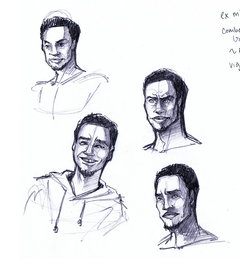
Some potential face shapes - you can see the edge of my notes about personality on the side.

I look at photos of actors and things to get an idea of what I want. I think I used 3 different actors here, I try to make it not look like anyone specific, but it helps keep the ideas consistent. Plus with actors you can find pictures at different angles of the same guy which is very convenient.
Ideation.
The Donovan on the right is getting a little too beefy. Also maybe a little old, think it's the hairline. Just trying some different poses to get a feel for the character. If one of the many sketches work out it could make a good basis for a finished digital piece.
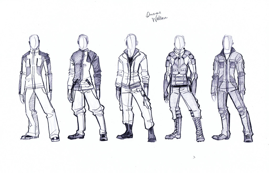
Clothing concepts.
So now I'm trying to figure out what he'll wear. We know his occupation, given that he's ex-military we can range from very military influenced to very casual. Lots of freedom, so I'm trying out a range. I'd think he'd still be a little military influenced in his look, since that tends to stick with you - probably not too movement restrictive; utility, comfort and protection are important.

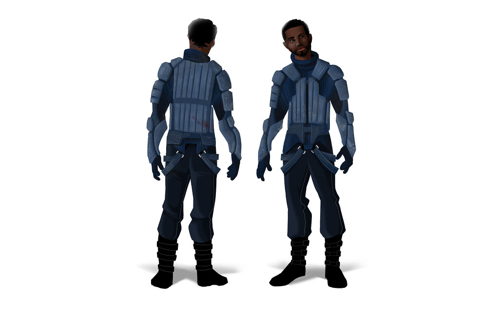
Now that I have some ideas, let's flesh them out:
Donovan # 1

Donovan #2

Donovan #3

I actually like number 3 best. It's pretty casual but the colors are interesting and not something you see as much in games. Usually it's pretty gritty, so the red/orange is nice and goes well the the skin color. I also like that the gun holster and tightness of the sweater carry the subtle military feel I wanted. It might be a little Nathan Drake though, unsure. I also like that this one feels "normal" but still futuristic enough to fit into a near future aesthetic. They probably won't be wearing moon boots in 60 years, but you never know.

That's a wrap for now.

Friday, July 1, 2011

Do the Monster Mash

So.... I'm behind on my schedule. Not too far behind, but the schedule is pretty demanding, so being even a little behind is not so good. However I am still plugging away! I haven't been able to do morning paintings this week because... I've been going insane. Also I've been trying to catch up on the aforementioned portfolio schedule, so I decided to break from the 2 hours paintings for the week. Class has been pretty demanding, but I don't think I can afford to let my personal goals slide. Oil painting is a good skill with a lot that translates to digital painting, but working to strengthen my core skill set is still most important to me. After all, going to graduate school is just silly if I don't use what I'm learning to improve the skills I need to succeed in the industry.

The past few days I've been focusing on doing monsters. I started with a lot of thumbs and pencil drawings. I haven't scanned them all, but I went through what I had and selected one that I thought had most potential. Before I started I made a list of things I think are frightening. I thought about things that I would be scared of in a game sense, but also things that frighten me on a personal level. Things I came up with included:

Things that are unnaturally fast.
Things that are difficult to see.
Things that want to eat you more than kill you.
Things that were human but have been warped unnaturally.

I think on a base level the reason we see monsters in games with human characteristics stems from more than just the idea that it's easy to rig things with identical base meshes. (Ok that is probably part of it too) It stems from a fear of what is inside of us, of what we could become in a nightmare scenario. You look at say, a zombie - not everything that makes zombies scary is the fact that they're gross or out for your brain, it's also that it could be you. If things were different you could be on the receiving end of that shotgun. It's things like this that I believe touch the base emotions inside all of us.

Here is my starting sketch:


I went more for the warped human than the unnaturally fast in this monster. I did keep the idea that it wants to eat you, and my original vision was that it would be wreathed in an paranormal darkness. there are human aspects, but it's definitely been messed with, like it was half eaten and infected with disease. The weird thing about monsters is that everything about them in my mind is supposed to be horrifying, so when making one I had to focus on making sure everything tied together with that theme.


It's unfair to go further without giving some credit to Colin Fix. I've been inspired by his work and there is no way I can deny that seeing his paintings has influenced what I did here. I went for flesh tone, but bleached out, like it's dead and been in the dark for too long. I went towards blue on the "human" side to further push that feeling. One side is less mangled and more power based, the other side is all gore and about brute force.


Getting into more detail now. I pushed the bright colors because 1) I think gore is messy and the brighter it is the more jarring the impact and 2) I think there are just too many monochrome monsters out there that are all browns and greens. Also I'm working to make the flesh more translucent on the left side.


I added eyes, if you can call them that... they are supposed to be sort of dark membrane sacks. I'm not perfectly pleased how they came out, but they look all right. I also started adding actual gore to show that he eats people and he uses the clawed right hand to do it.


Not perfectly sure if this is finished, I think I will definitely come back to it. I added a smoky shroud to it to give the sense that it floats through unnatural means. I see the left hand as having some sort of power, probably which it uses to incapacitate prey. Still I don't like how much it obscures the hand, there needs to be a better way to depict this. Also I want to come back to make the right side more sinewy, I feel like there is too much brightness on some of the boils so it's drawing attention to them and making it look like bubble gum balls or something :) But there are aspects to this that I'm proud of for sure. Considering that I haven't done monsters up to this point it was a good first attempt. I will keep working.

Tuesday, June 28, 2011

ALIENS!

No scene painting yesterday (Saturday) because I went to the pride parade and that took up a chunk of my morning. Pretty intense, I haven't seen that much man junk since I took life drawing. Then today, I wanted to take some time and finish one of my personal assignments for my portfolio. It's not done in that I haven't done the male version in polish yet, but I thought I'd post what I have for the time being.

One of the things on my list that I'm working on this summer for my portfolio is to design a humanoid alien race. I've been working on it all last week and I narrowed in on what I wanted until I was pretty happy with the concept. Where I started was that I wanted a race that would be suitable for a game and would be something that players would find attractive, so it needed to have humanoid characteristics while still being alien. This was the rough framework. From there I started looking at pictures of different animals. I ended up with a lionfish and a mudskipper and thought it would be a fun idea to have an aquatic species that appeared to be in the process of evolving from water to land. I threw in a little octopus to keep it aquatic and push the alien side. Here are some of my concept sketches:


Lots of suction cups, camouflage markings, webbed digits etc. I threw in a tail because I thought it pushed the whole evolution-in-process idea. At the same time I kept the silhouettes very idealized human. As I worked I developed a concept for the race as a whole:

These people were exposed to space flight by other alien cultures, they didn't invent the means to travel off world themselves. Their society is tribal and it was determined that no male of the species would lower himself to leave the world to parlay with the interlopers, so the females became delegates for the species. This has become extremely attractive to the females of the species, who enjoy a sort of empowerment off world. Many do not return. Males generally only leave if exiled.

While the species can exist for short periods outside of water, for prolonged periods of time they need to either undergo surgery to adapt their lungs to oxygen or wear head pieces. These head pieces serve two purposes: they recycle and filter water to allow their gills to breathe and they also provide an environment for their kelp-like hair. If the hair fully dries, the follicles will seal and the hair will never grow again, so the head piece is necessary if they wish to retain their hair. Because it is taboo, if a male leaves he shaves his head and adapts his lungs as a rite immediately, knowing he can never return. For females to cut one's hair is unthinkable, it would be like going native in the worst way. Women of the species are usually very proud and outgoing off world, probably as a counter to their oppressive culture.


Once I decided on the general look, I went through several types of eye shapes and head pieces. I worked on the coloring, I wanted something aquatic, but not too stereotypically aquatic, so I went more for green than blue. I ended up with a look that is somewhat salamander-esque. The body is covered in markings and suction cups. For the eyes I wanted something large like a fish, but still not creepy looking. Despite trying a number of shapes I went for something pretty human, just because straying too far made her look odd and unattractive.


Finally I played with different costumes and color schemes for clothing. Because of how proud they are, I thought bright colors would be best. These are not intended to be clothing for the culture, but rather off world clothing shared by a mix of alien societies. The center is my favorite. I wanted a look that was sexy but also strong and proud.

They are still a work in progress, but they are coming along.

Saturday, June 25, 2011

Drawing for 6/25

Staying away from leaves again today... decided to do a city skyline.  I'm still in a sci-fi mood, but there isn't anything exactly overtly sci-fi about the finished piece.

I started with this image:


"Skylines" by sanchom

...And my finished drawing:

Night time.

It took about... 2 1/2 hours I think. The photo was really just a jumping off point. In retrospect I could have probably lowered the whole thing a bit to show less water and more sky. I also used a lot of different colors... I went back and forth about maybe making the colors a little more within the same scheme, but in the end I thought the variety of colors gave it less of a polished futuristic "star trek" look and more of a realistic bladerunner type look. As Tim Gunn would say, it's a lotta look.

Friday, June 24, 2011

Must... keep... drawing (Drawing for 6/24)

Something a little different today... I decided to do a drawing from a thumbnail I sketched last night. I always keep paper on my desk, so when I'm doing stuff on the computer I can doodle, like while mail loads or during a game cutscene. I did a little sketch of a corridor and thought it would be a fun thing to try for my drawing today. Also it put composition totally in my hands, which was good for a change.

The sketch:

Simple, but it has potential.

I liked the angled windows, I thought it looked sort of futuristic. I didn't use any real references, just some different concept art pieces to look at how people applied brush strokes, nothing huge. I did start differently though - given how geometric it was I decided to do some hard lines in black down first.

No, it's not vector. Don't insult me.
Then I just sort of went for it from imagination. I've played a lot of sci-fi games so I just drew off my impressions of what I thought an observatory type deck could look like.

Working in gradually. The scariest stage for me.
Details are where the fun starts.
It's sci-fi, so we'll shine it up a bit.
It was a nice break not trying to copy anything. I think the fun I had came through in the end result. And there wasn't any freaking leaves! Sometimes children, we just need to put the leaves away. For a little while.

The concept was an observation corridor on a space station or ship. I thought using the windows to project information would be fun, so if you were looking out the window it would help you observe star data or orbital information or what have you. Maybe you could just browse youtube. I don't know. :) I think it came out reasonably well.