Friday, January 27, 2012

Messing around

I recently picked up a copy of Doug Chiang's Mechanika. I haven't done much with markers since undergrad, so I thought it was a good opportunity to flex the atrophied marker muscles and try some simple sketches.


Nothing too fancy, but the technique in the book was simple and really clean so I think I'll keep practicing. I miss drawing on paper. All I used above were prisma color markers, micron pen and a ruler.

A friend of mine asked me to help him design a Cthulhu themed sleeve tattoo, so I've been doing some reference research. I saw some interesting designs of morbid looking trees, and so I pumped out a little doodle that I ended up kind of liking:

New stuff

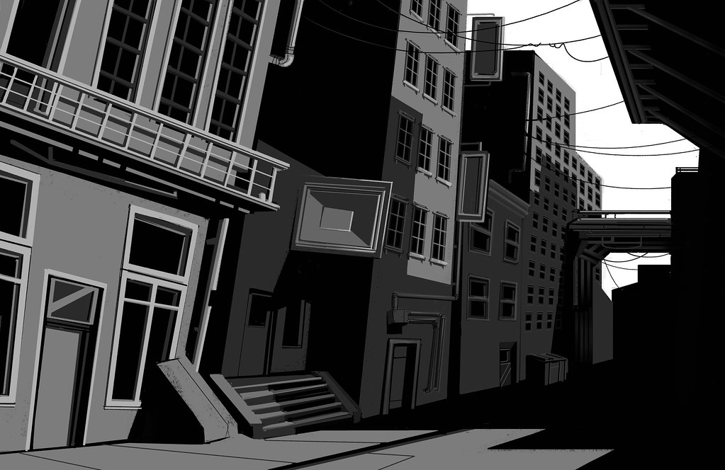
I was recently inspired by the concept art for Deus Ex Human Revolution, so I decided to try and apply some of those concepts to a new drawing. I'll put up the progress drawings here to sort of explain the process.


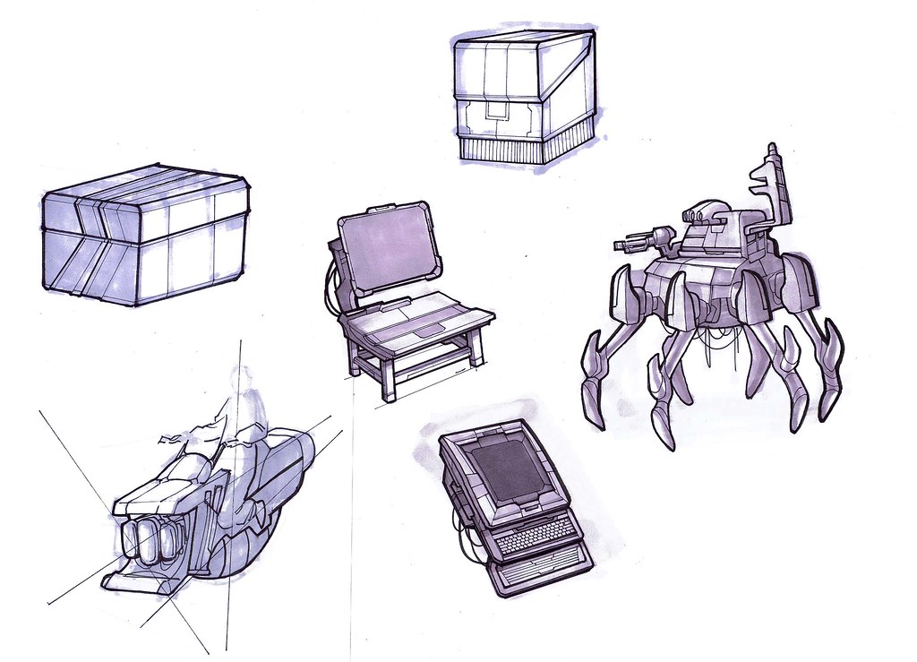
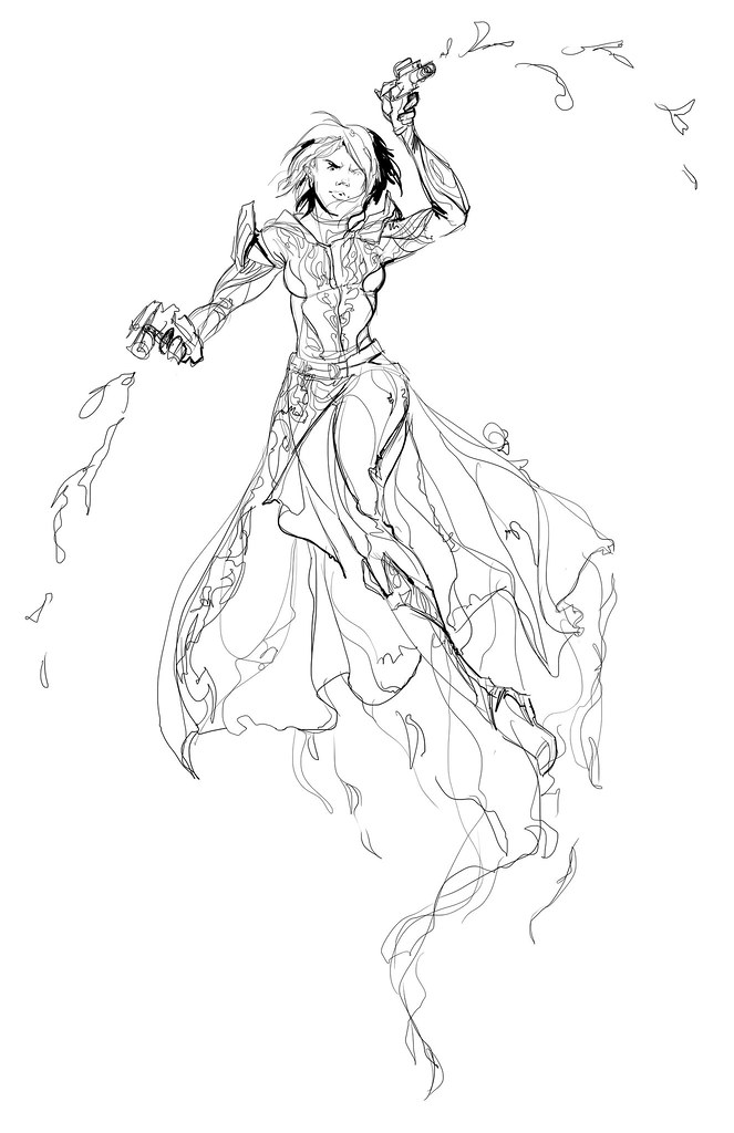
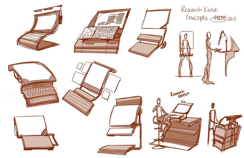
I started with a rough idea of what I wanted. I planned on doing a research station. I'd previously done a research kiosk prop, and I wanted to create an environment to showcase that. I figured the space should be set up overlooking a testing area. I wanted the time period to be slightly but not ridiculously futuristic. (yes holograms, but also yes to paper, pens and books)


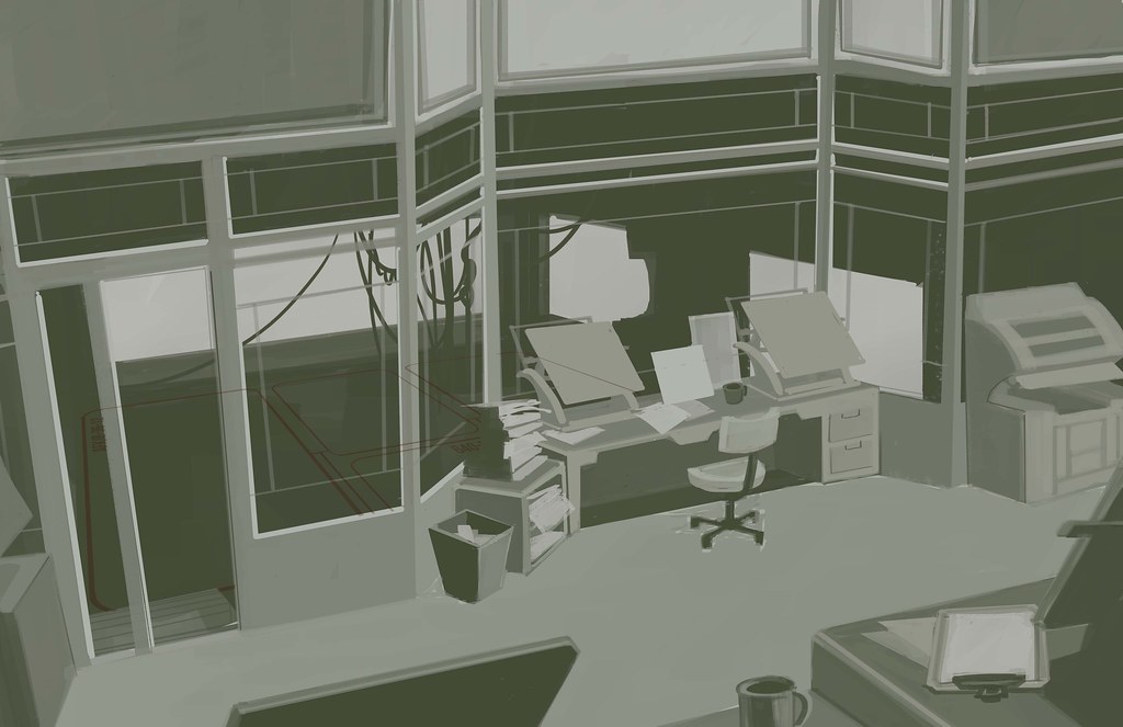
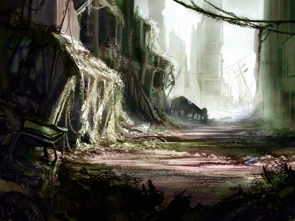
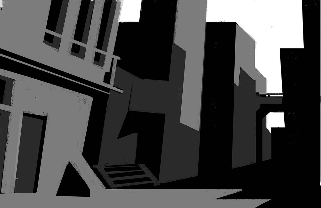
After getting the basics shapes in I started messing around with the lighting to make sure the piece was clear and understandable.


More lighting, contrast adjusting. Working with the value and really messing with the composition of drawings in the early stages has become increasingly important to me. Even though it's easy to get excited and want to rush forward, I am trying to really get the most out of the value and lighting, I think those things make or break a nice piece. Especially when your reference is the art for DX:HR, that style really seems to be all about contrast, lighting and color.


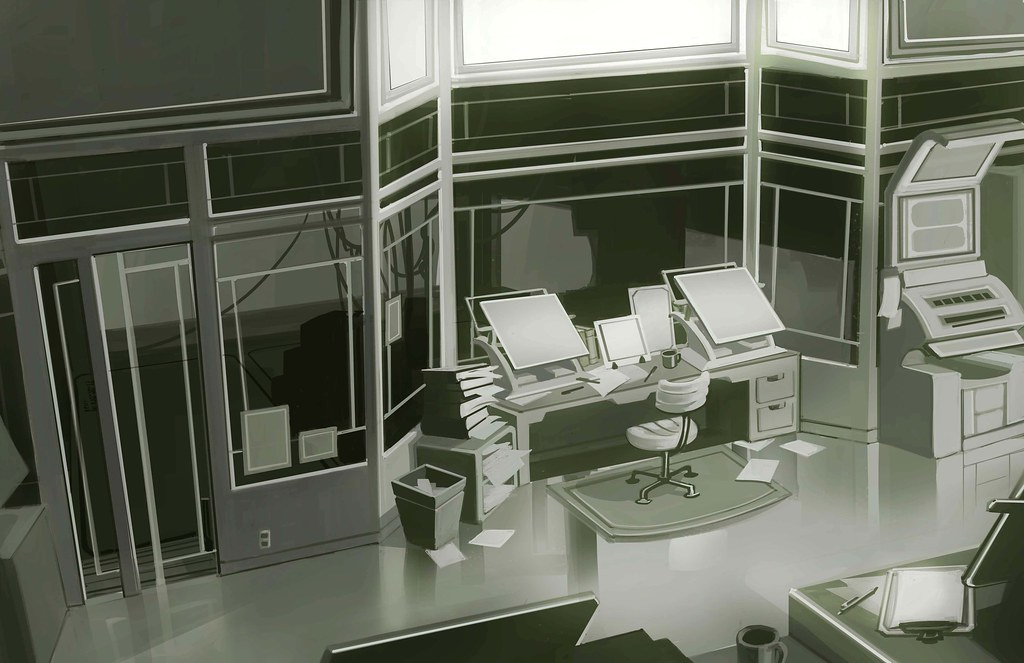
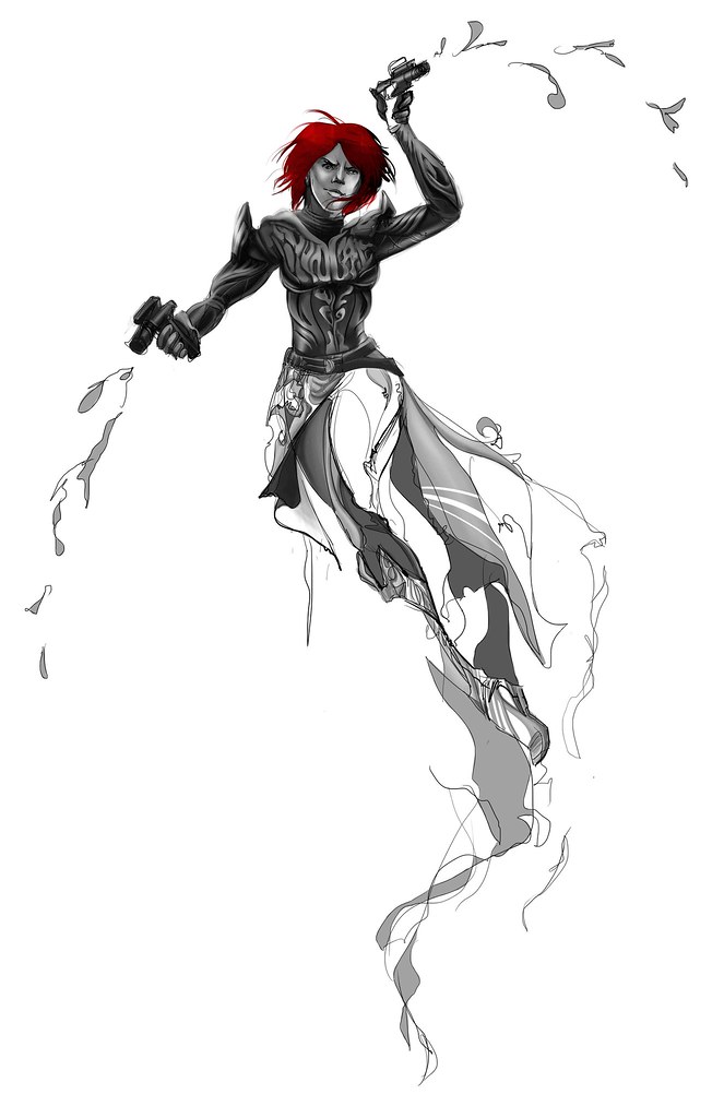
More details, continuing to push the lighting and contrast. Toned down to greyscale in prep for coloring.


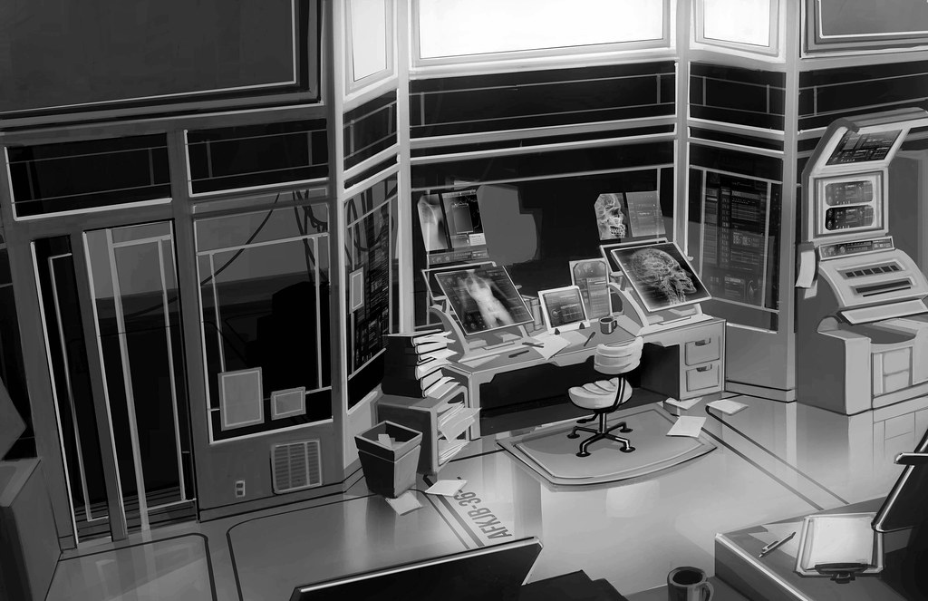
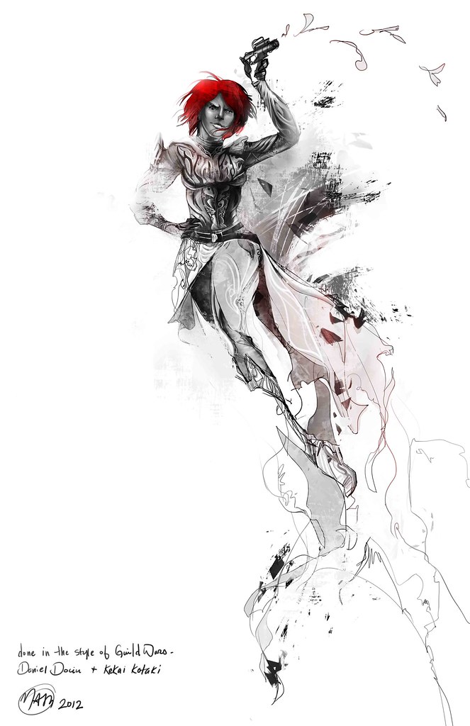
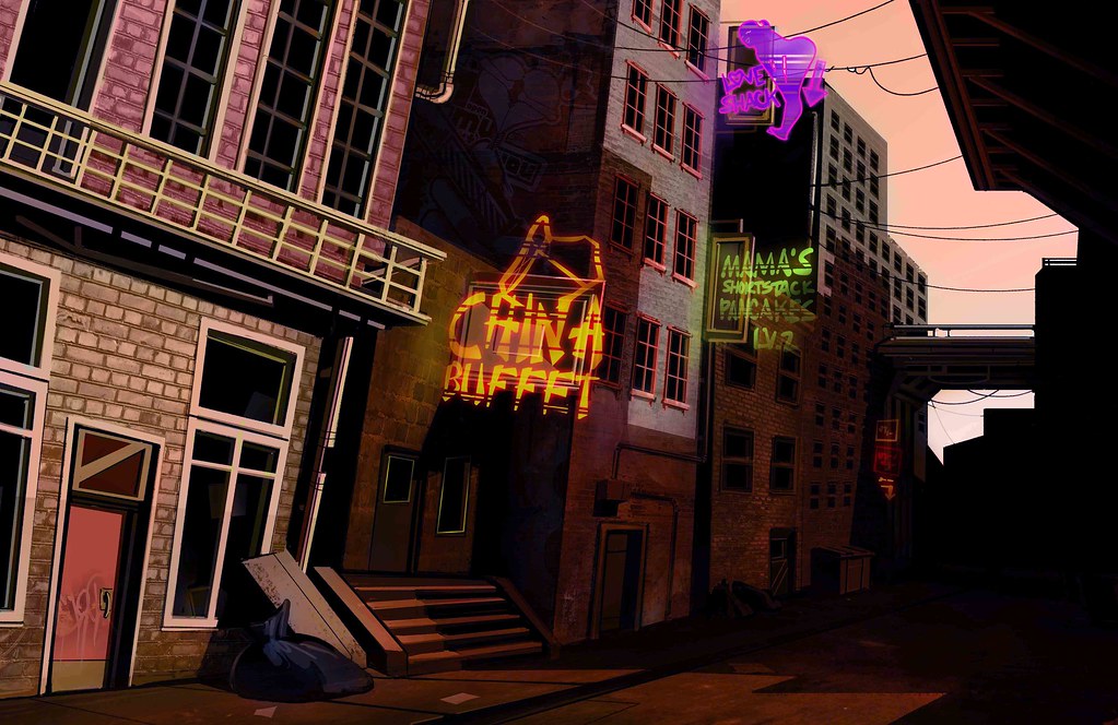
I kind of had a color scheme like this in mind from the beginning, hence the green tone on the early drawings. I played with a lot of color combinations, but in the end I came back to this one. Sometimes it's hard to tell if you're coming back to the original color because it's best or just because your eyes are used to it, but I think the green works well for the laboratory feel.


Some final lighting tweaks. These were made mostly in deference to the DX:HR art references. I usually don't like to muddy up the atmosphere of my drawings, but I think I tend to draw everything too clean and the purpose of trying out new styles is to see how a thing works right? In the end I liked the lighting changes, it makes things softer and more atmospheric.

Saturday, January 21, 2012

Snowy Mountain Town

Been trying to get back into my three hour speed paintings. And failing. I need to set more rigid timelines. The trouble with being on break is you want to keep coming back and tweaking, and that defeats the whole point of everything. So I'd say with futzing and messing around this is more like 4-5 hours over two days.


I've been working more in black and white to start lately, just to really focus on values. I'm not sure if it's actually good or bad. On the one hand my values are improving. On the other hand I think my colors feel less spontaneous. I've been painting back into the finalized work and this seems to help somewhat.


This is the spot that I don't like, where everything feels soft. It's in between being gestural in a cool way and being detailed in a cool way, but instead to me it just feels like halvsies with all the negative bits of both. I've been told I'm too harsh on myself, but I really think it's true!


And this is where I am at. I think it's less soft, but it still feels a little halvsie-ish. (I'm inventing words!) It definitely feels better, but the definition on the town feels somewhat out of place with the background. I'm still trying to decide how to rectify this in the future, but I'm going to try to keep my hands off this for now.

Various stuff

I've been trying to experiment and do some different things lately. I got inspired by Guild Wars promotional art and decided to take a look at the images and see if I could do something from scratch that was similar. I never work this way, so I'd say the drawing took 4-5 hours with all that noodling I'm trying to stop doing.

Line
So I started with the line. It's way sketchier than I like to work, but I'm trying to loosen up a little and be more gestural.

Adding value
Then, while referencing the other GW promo images I looked at how and where the value was applied and started trying to mimic the style. I took out some of the line and started punching values in selective areas.

Texturing
I ended up altering the pose because the movement directions felt wrong. I'm not sure if this really works either, she feels kind of stiff now. After I got the intensity of the values the way that I wanted I went in and added texture elements like I saw in the GW images. Overall I'm pretty happy. It was a fun experiment.


I've also been doing some props stuff lately. Here are some research kiosk designs I've been working on:


Digital Paintings

I've done a few environment paintings over the winter break. I try to keep things short (3-4 hours) but I find I end up nit picking and noodling over them. It's a bad habit and I think it makes things look overworked. I'm trying to cut it out and be more efficient. Still, here are some progressions on recent paintings:


I actually really like the colors here, although it's a bit like an oil slick.


I've been really trying to experiment with color. I have a pet peeve with all the gritty realism I've seen in recent years, so I've been trying to create sort of a heightened realism where things look realistic but with slightly more saturated colors. I've been trying to play with color combinations and create ambiance through color choice. Sometimes it ends up looking like a leprechaun urped rainbows all over the drawing, but other times I feel like it really adds something.

Here's a drawing I've been struggling with for color choice. I ended up putting it on the back burner, so it's technically not "finished" in my mind:

Color scheme 1: late afternoon
Color scheme 2: dusk
Color scheme 3: night
Each scheme changes things differently. I like the 2nd one the best because it has the widest range of color in it, but each one adds and detracts something. It's something I'm still trying to analyze and understand better.

If you like thumbs, here was the progression for this one. Slightly different than my usual way:

Base thumb
More detail

Pastel drawing

It's been a while. I've been really busy drawing and less busy with updating.
Here are some pastel drawings. These were 40 minute drawings from live models:


We get mostly female models, which is kind of limiting. Although I do really enjoy drawing women, so it's not a total loss. I have more of these up in my fine art flickr album. Drawing from life is really informative, but tiring. I also prefer digital because I don't like to get covered in mess. I know, that's pretty ridiculous isn't it? If you saw the state of my apartment you'd tell me it was obvious I have no aversion to mess whatsoever.