Wednesday, December 26, 2012

Christmas Fun

A week ago a friend of mine, Kelley McMorris, posted a really cute redraw of a drawing she'd done as a kid. She posted the original doodle from her 8 year old self, then her redraw of it side by side. It was cute and really neat, so I thought when I went home for the holiday I'd try it if I could find some childhood drawings of mine.

I sat down yesterday and redrew "Ivy the Centaur," a drawing from when I was around 13 years old:


I think this is the first centaur I've drawn since I was 13 years old.
It was really fun to do, so I picked a different drawing from when I was 14 or so and did that one today. I think I remember the character was supposed to be a goddess of whales, in human form? Sadly I didn't really document my character creation process very well back then. ;)


"Urscia," goddess of whales

Overall it was pretty funny redrawing childhood drawings, I might do some more while I'm home for the holidays.

Friday, December 21, 2012

Drawing from Reference

I always have a lot of characters floating around in my head, and as I've mentioned in earlier blog entries I like to unwind drawing people. My passion for concept art is about telling a story - usually I like to do that through an environment, but characters have very personal stories inside of them and that makes them pretty fun to draw. I suppose I enjoy drawing women because I am one, and I identify with female characters more personally. I have nothing against drawing men!

While my pencil drawings are usually pretty standard poses and come out of my own head, sometimes I like to get references and often there will be an image that really jumps out at me. I was browsing around this afternoon and found a couple of cool images that inspired me, so I used them as the basis for some quick drawings of one of my characters:

Image courtesy of Tigg-stock
Look at that awesome cape!
Image courtesy of ec-stock


This particular character of my inventing leads a dual life as a noble woman and a warrior. They are simple line drawings with minimal rendering, but taking a break from environments and doing something different from time to time has a recharging effect on me.

I've seen lots of people struggle, and I think it's important to remember when working with reference not feel married to your reference. It can be easy to feel trapped by a reference photo, but it's just an aid in making a drawing. Costume, facial features, even the pose can be changed... the photo is just there to serve as a reminder of what the natural form looks like.


Monday, December 17, 2012

Doodles

I was throwing out a bunch of computer paper from my desk today and took a few  pictures of some more lady doodles. I don't remember who all of them are but there's a Triss Marigold from Witcher 1 and my old KOTOR 1 Revan with the black ponytail in there.


Sunday, December 9, 2012

Trying a new style

I got inspired by some pieces I saw the other day that heavily used photo compositing, so I decided to try it out. I like the results a lot. The following pieces I did in about 3-4 hours this afternoon:

Snow practice:


Castle ruins:


Tuesday, November 27, 2012

Work Dump: Storyboards

Here are some presentation boards I did for various projects over the past few months. This is sort of a random selection, I did a lot of this sort of thing. Turnaround on boards was pretty fast, I'd usually do a set every few days or so.


And for fun here's a goofy character design I did recently for a side thing:


Work Dump: Dungeon textures

I had to do a lot of textures for a recent project involving a dungeon. I'm only going to show a few, there are truly a million of them. I did some texturing in Maya back in undergrad, but it has been a while. Nothing reacquaints you with texturing like having a whole dungeon thrown in your lap! My co-worker and I decided the look would be stylized and a little painterly. It went through a lot of iterations, some more painterly, some more colorful. In the end it was decided the colors would be pretty muted, but it was a lot of fun to do.

I have some screenshots of the Maya file, unfortunately it doesn't have the in game lighting which really shows the textures off nicely. This makes the screenshots at the bottom look a bit drab.


^Here is the master floor texture. It was a demo dungeon, so it was to show three different levels in one space.


^Some different types of walls, a door, and a column. Also the ash from a pillar that burns in-game. I think my co-worker might have taken a pass at the metal on the door too, so I don't get full credit on that one.


^Here is the dungeon screenshot, minus in-game lighting.


^Here are close-ups of the different area textures. I didn't do the exterior brick wall, that was placeholder. A bit drab without the lighting, but it was still pretty neat to work on things that actually show up in the player experience. One of the things about being a concept artist is you draw a lot of cool things that inform the final product, but you don't get to see anything you yourself made in the game. So this was pretty fun for me. I did some storyboards and UI work for this too.

Work Dump: UI Design for Midway Arcade Orgins

The company I work for recently put out a compilation of old Midway arcade titles for Xbox and PS3. It was pretty fun to play the old games... even though I'm miserable at them. I enjoyed arcades a lot when I was a kid, but the Midway titles were before my time. I was more of a Streetfighter II/Ninja Turtles/Simpsons kid.

Since I have to wear a lot of hats at work, I ended up designing the UI theme for the game. We went through a lot of ideas but ended up going for a starry nebula thing. Here are a couple of the many iterations we went through, as well as some of the logo design:


^First version, and the one I liked the best. Sadly we couldn't put the text on slanted planes so this didn't work out. The shinies (golum! golum!) might have been a little busy to the eye, had they been implemented.


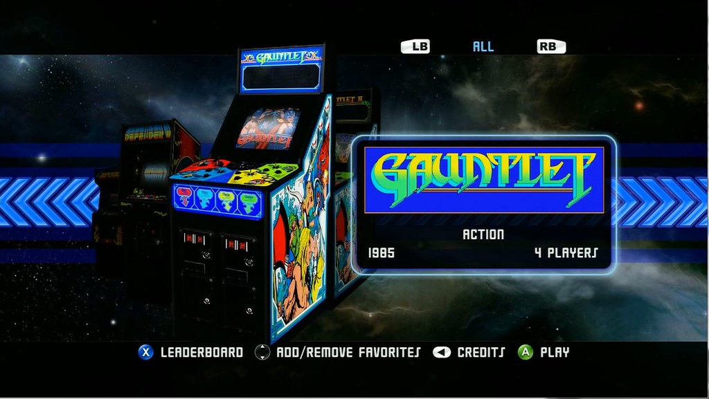
^This was getting closer to the version we went with. We wanted to be able to scroll through the cabinets, the guys were very passionate about featuring the cabinet art. It was a lot of work finding all the cabinets we needed!


^Placeholder cabinets, but this is very close to the final version. The star is for favorited games. One of the guys on the team had the idea to change the arrows, and I think they looked a lot cooler than the previous place-holdery ones.


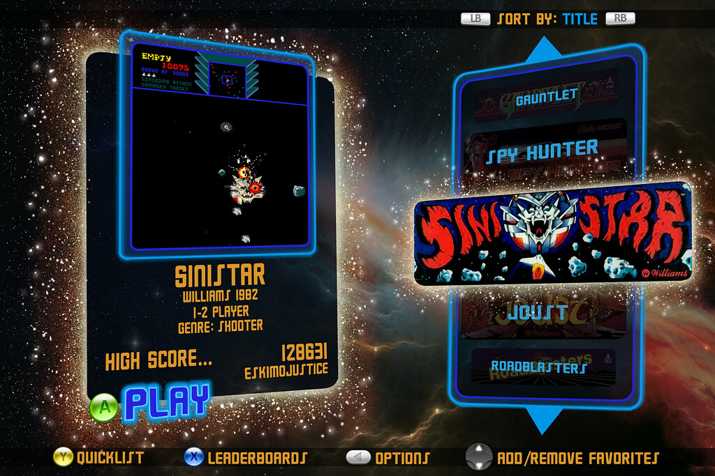
^Here is the screenshot from in-game of the final main menu select. Pretty much the same as the above concept. We played with the nebula and its color a bit. Sorry for the sloppy screencap, I should crop that.


^Help menu concept look.


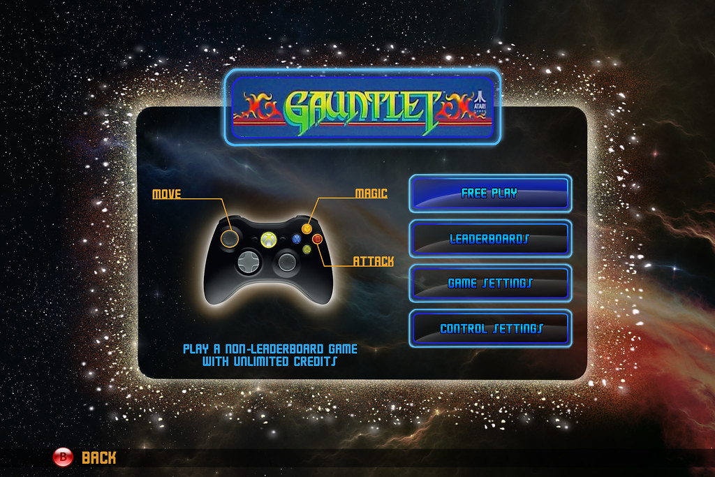
^Early look for the game options screen.


^Screenshot from the in-game options screen. Another sloppy screencap.


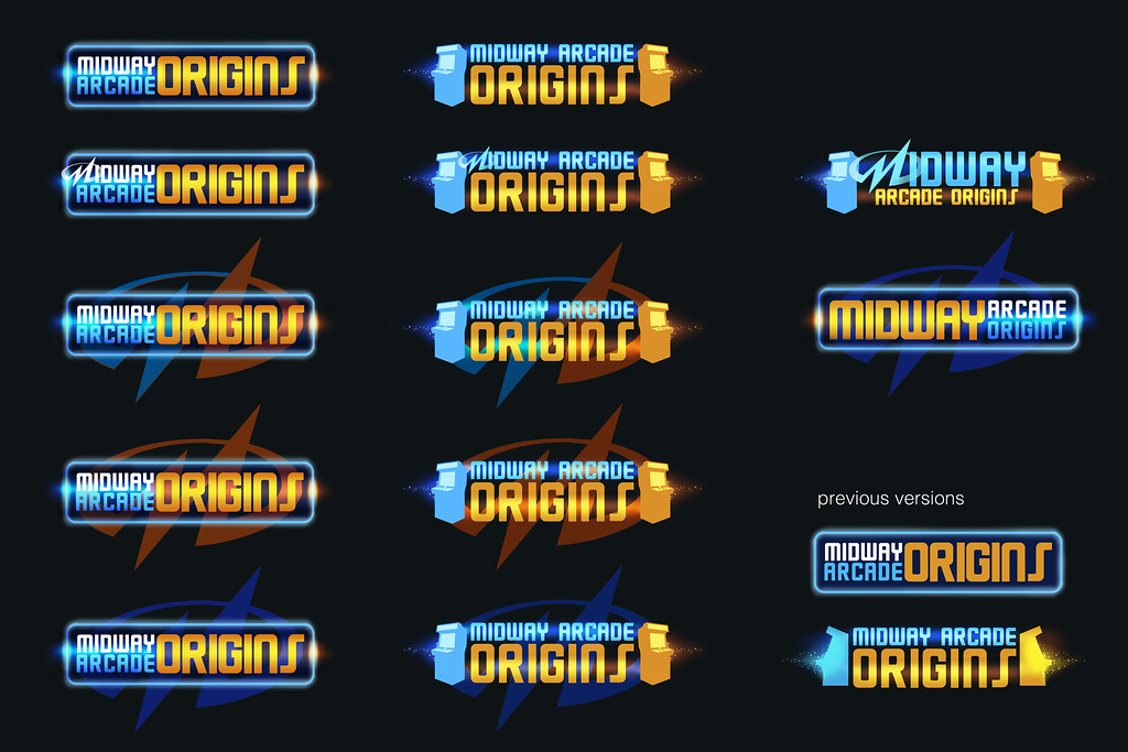
^First pass at logos before the title was finalized.


^Later pass on logos after we knew the name of the game.


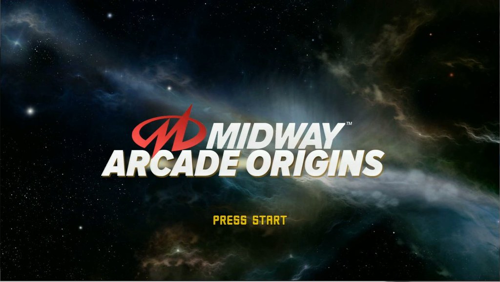
^Actual intro screenshot, splash image. Ended up not using the logos at all!

The nebula came out really cool in game. Kudos to the great people I work with, the nebula drifts around really nicely on the game screen and the stars twinkle subtly. I'm proud of of how it came out, everyone made it look fantastic.

I had a lot of fun working with the guys designing the look. Since it was a compilation we got to spend a decent chuck of time on the game menu experience, making sure things were clear and easy to navigate and looked cool.

Work Dump: Fireworks

Here are some fireworks studies I did a while back for a project that probably won't see the light of day. It was a pretty neat idea and I enjoyed doing the reference research for it.


Sunday, November 25, 2012

Sandstorm Progression

Progression post! I just realized that I had a huge typo in a post title from a few weeks back, and it's just been that way... oh well. This is why I'm a drawer not a writer.
Here's the progression on the sandstorm I teased a few weeks ago. I picked at it here and there since:


This was the original drawing I posted ^ which was done in a few hours.


Added some detail rocks, and I was working on making the mouth look more sandy. I put the guy on a horse to give him more of a reactionary pose. I also moved the balloon out so that it didn't get lost.


Small adjustments to the mouth angle, swapped the rocks so the right side wasn't so heavy.


Finally, I added some more horses. I wanted it to look like a group of nomads had been wandering through the area when the sandstorm blew up very suddenly, chasing down the balloon and taking them by surprise.

I've had a lot of people asking how I do clouds. I will try to do a post on that at some point when things calm down, (ahahahaha...ha) but it really boils down to getting or making a good quality cloud brush that you like, then taking a soft-round with a high transfer and very slowly building up cloud shapes. Using a straight up cloud brush generally makes things look cheesy, but the combination of a good cloud brush and hand painting into it with a soft round really gives you the hand-done feel. I don't use photos much for clouds and I really do not care for the smudge tool, I find smudging wrecks more than it helps in my process.