I really need to block amazon from my browsers. I was on there looking for something reasonable and practical (actually I think it was to pre-order Mass Effect 3) and as usual I got sucked into looking at concept art books. And of course, one can never just
look at concept art books.
Soooo... the latest addition to my concept art library is
The Art of Uncharted 2. This book has been on my wishlist for a while, and with Uncharted 3 coming out soon I figured it might not stay at 40 bucks for long. While that is more than I tend to spend on "extravagances," this book was definitely worth it. Over 270 pages, it has huge sections on 2D and 3D character development, layout design, gorgeous paintings, props, and even sections on cinematics, color boards and visual effects.
It arrived yesterday, and as I was thumbing through it a few of the digital paintings really stuck out at me as having a cool style. The artist's name is
Shaddy Safadi and I really recommend checking his stuff out, he's very talented and funny. My curiosity was rewarded when I found that he posts all his personal brushes for free download. I was eager to try out the new brushes, so I decided to do some painting. It's been a long time since I tried this in earnest, but I'd just gotten some nice tips about brush shapes and Photoshop settings from Michael, so equipped with new knowledge and brushes I grit my teeth, brewed some coffee and pulled up my cintiq in preparation for some SERIOUS PAINT ACTION.
I worked for a total of about 5-6 hours. Given that I'm rusty I suppose that was acceptable, but I think the quality of the finished product should be more reflective of a 3 hour effort. I will keep practicing. I really want to have some digital paintings for my portfolio, so this is a step in the right direction.
I started by going online and looking for some stock images to inspire me. To be clear, none of the stock is in the final piece, it was just reference to help me paint. I got a few images and sort of laid them out in a way that interested me.
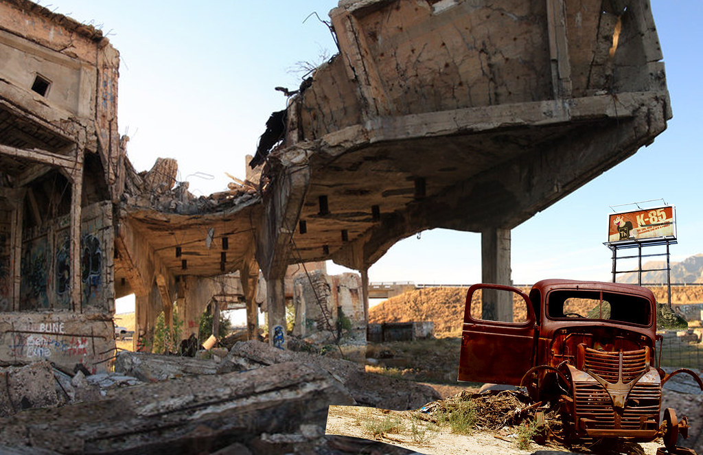 |
| Still life with rusted beater car. |
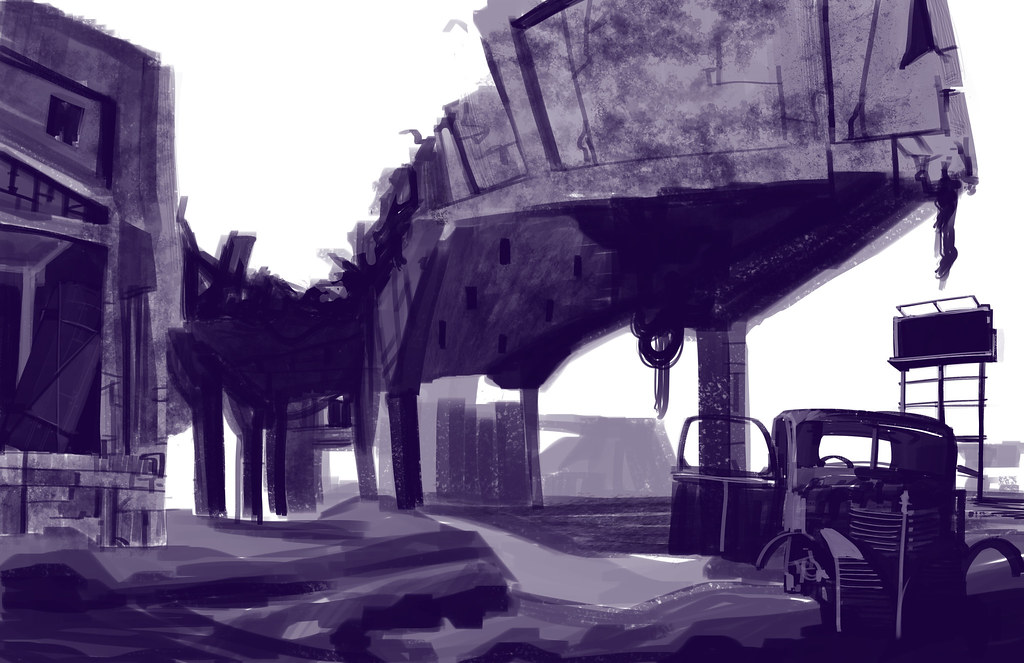
Then I started painting. I think this is the hardest part for me, the beginning stages feel so vague and I never know what to do. I started in monotone to try to save myself some pain and just worry about value.
 |
| I feel like it should look less scratchy at this stage. |
 |
| The texture is helping. |
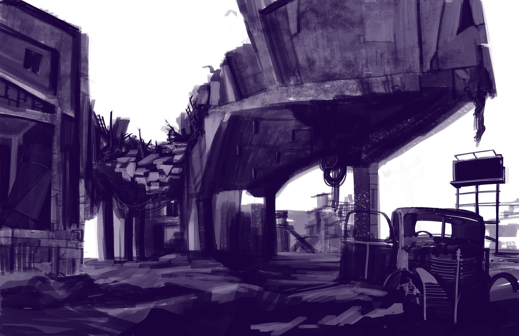 |
| The ground and shadows seem more coherant now. |
So it wasn't perfect, but it's been a while since I drew like this and I thought to myself "This isn't so terrible. Maybe you shouldn't go to the bathroom and weep with despair just yet." Instead I poured myself another coffee (probably number 8 or 9) and decided to press on.
So just when I was finally starting to get happy with it, another variable got tossed in: color. I set my layers to multiply, but even so I didn't get the color substitution I wanted. Maybe I made a mistake. Anyway, the color made everything schizophrenic and I lost a lot of contrast. I had to go back over the image in a new layer to push my darks back in.
 |
| Finally got the contrast back. Colors are sort of all over the place though. |
From the beginning I wanted to do overgrown ruins, so this was the part I'd been looking forward to: adding plants. I had to be careful to not lose too much of the detail I'd worked so hard to establish. I also didn't want to lose the "point" of the picture: the scene is about a decayed structure. Too much foliage and it might be hard to tell what is going on. It was also an opportunity to start creating direction and a focal point with my light source.
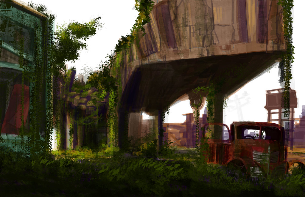 |
| Let there be grass! |
After this I wanted to tie the image together and unify the tone and color. I tweaked around with gradients and even adding clouds, but I didn't want things to get too busy. In the end I came away with this:
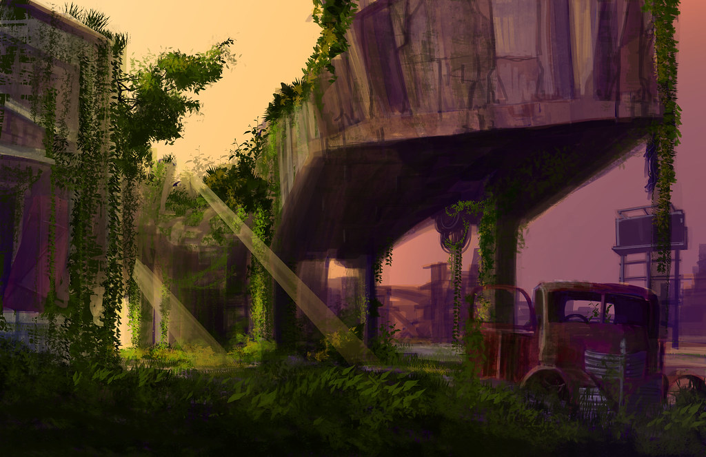 |
| The end result. |
It isn't perfect, I still think it's a little busy. I'm not sure if the colors are quite ideal, or if they mute the subject matter a little too much. I also think that there are some questionable composition decisions happening at the top of the image. But, overall, for a first effort to get back into digital painting I'm pleased. And I love the brushes. I'm supposed to get some more brushes soon, so hopefully I will have lots of resources to make some great paintings!
Maybe once I take a break I will come back to this and do some more fixing.
I think (in my completely underqualified opinion) that it looks fantastic. My only critique would be that the two rays of light look as though they are coming from different sources, rather than a single (presumably) sun. I'm not sure if that's what you're going for, but it's a little distracting. Pull the top ray a little closer to horizontal, or the bottom one closer to vertical, and it'll be perfect.
ReplyDeleteIn other news, holy crap I wish I could paint because that seriously looks super cool.
Great idea and photo comp. Your digital paintings are looking good! I like the second to last image in this post too, but I see you wanted to set "da mood" in the final. Maybe try adding some oranges and reds into your purple-dominant sunset?
ReplyDeleteFor colorization from a black and white value layer, try setting the Blending Mode of your color layer to "Color" or play around with the Blending Modes.
Lastly, wow, you seriously have been drawing in bulk! I'm so impressed, girl. Take it easy on that hand of yours.
"Color" huh? Thanks, I will definitely try that out tomorrow! Good luck on your project deadline!
ReplyDelete