Not exactly the under layer, but this was an early stage, around the 45 minute mark:
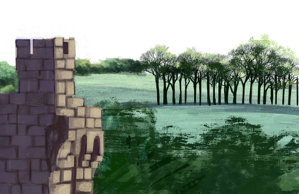 |
| I was nervous about adding in the foreground bushes/ trees, intimidating. |
 |
| Green and pretty. But the castle feels sort of odd next to them. Also it's boring. |
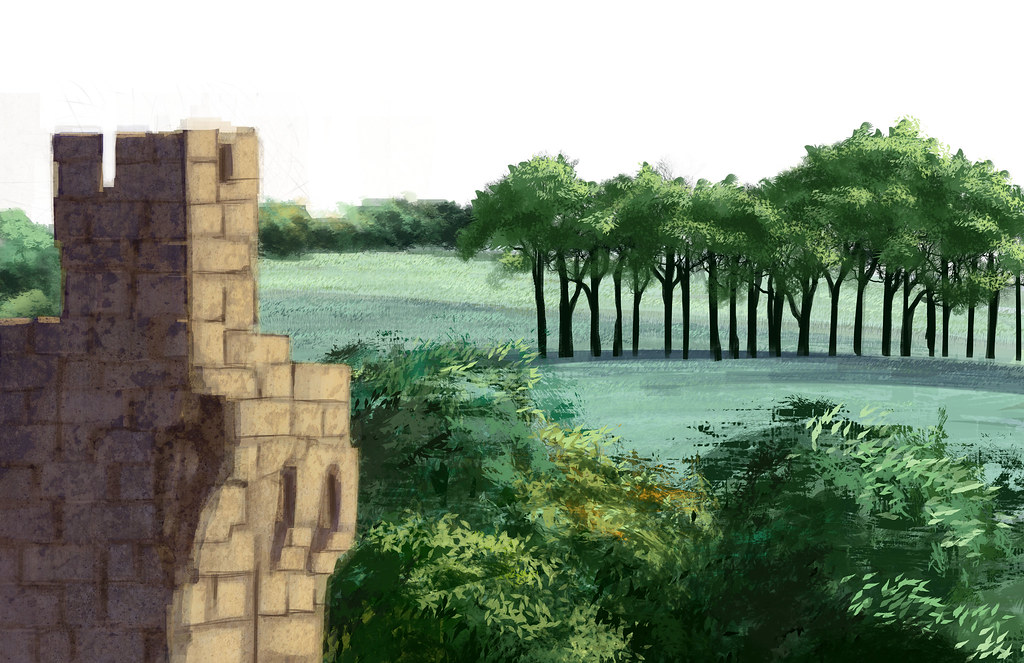
Gradients and lighting is added, but it's really desaturating things:
 |
| Like a sea of grey mediocrity. |
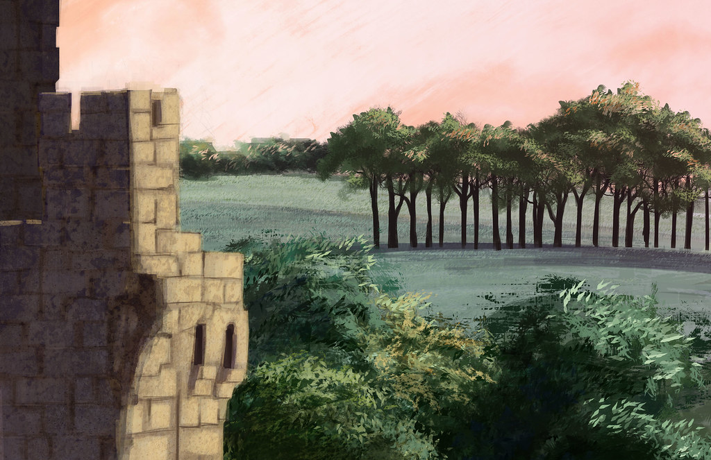
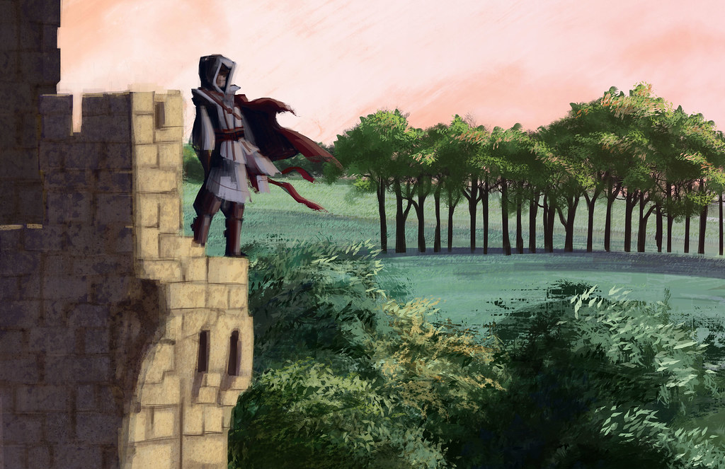
I've been into Assassin's Creed lately, so I added a little Ezio. Not sure the environment really suits him, it's too serene:
I also boosted the saturation on the midground trees to try and combat the washed out look. I'm not sure I was entirely successful. Issues I ran into were that it was hard to get the castle and the background looking like they were in the same place. I think this was an issue with lighting, maybe contrast as well. I know they go together, since it was from a photo, so the failure was in the execution. In the end, lowering the contrast on the background was the only thing I could think of to do that brought them together, but it really washed things out.
If I'm proud of anything, it's the execution of the foreground trees. I feel like they actually came out looking painterly. Considering I have next to no formal painting training that makes me happy.
Adding the figure was for fun, I only spent about 15 minutes on him... but he's just another element in the piece that sort of adds discordance. Part of me thinks it looks fine, part of me thinks it's way too busy and part of me thinks I'm being overly critical. Ha.
I like how you used a leaf brush for the trees, it looks really cool.
ReplyDeleteI learned some tips for creating distance in my portrait painting class; maybe they would be helpful to you.
1. Distant objects are cooler in temperature
2. Distant objects have less contrast in value
3. Distant objects have less detail and softer edges
In your painting, the grove of trees in the midground are really popping forward. This is because they are warmer in temperature than the foreground trees. Also, the sharp shapes and strong contrast between the trunks of the trees are bringing them forward.
So I would recommend lightening the values of the trees, cooling them down, and softening the edges, especially around the trunks and around the tops of the trees. Then I would warm up the foreground trees. For the castle, increase the contrast and sharpen the edges. As you can see, Eizo has a lot more contrast to him than the castle he's standing on.
I hope this is useful. :) I really admire how dedicated you are to digital painting.
That's REALLY helpful! Thank you so much!! I can figure it out through trial and error but just having someone say something like that saves me so much time! I will apply those thoughts to my painting this morning.
ReplyDeleteYou're very welcome! Yep, that's why we're in school - eventually we could probably figure everything out on our own, but getting tips from teachers and classmates speeds things up. :)
ReplyDelete