Showing posts with label photoshop. Show all posts

Tuesday, March 27, 2012

A week's worth of dumps

Some things I've been working on this week:

Some alternate angles on a bug and a bobcat, plus a new iteration for the tramway I'm brainstorming.


After my thesis was passed my director told me I needed to work on finishing. I'm not sure this is very successful, but I dedicated a few hours to working with photos and trying some detail, but it's tough to do without it looking overworked. I think I need to start doing some style analysis.


Work in progress, messing around with different ideas. Still fighting with simplistic shapes vs. overworking.


I'm sure Hemmingway is doing back flips in his grave over this one.


Trying out some different thumbnail refinement techniques to get away from my cartoonishness. These are for the club we started, we're building a post-apocalyptic city on the ocean. Some are not really complete, some are less thumbnails and more preliminary sketchwork.

Monday, February 6, 2012

Props, etc

Well, school started up last week. We recently had an assignment in my hero to take a number of pre-created props and draw them in different angles. The assignment was just line drawings, but I thought it would be a good opportunity to practice trying some other paint styles and trying to color the props similarly to the originals as well. The only prop I know the artist for is the 4th one down, which is by Dan Ghiordanscu.

 It was actually a pretty challenging task. Line didn't take very long, but the bottom 2 color props took a while to color because I'm not very practiced at the style. It's encouraged me to try to do more of it though, so I can improve.

Other stuff I've been working on... took some of my old thumbnails for a Russian character circa 1812 and did a quick(ish) painting of what I thought were some of the more successful elements. I think it took about 2 hours.


I looked at Justin Sweet a bit earlier and I think that rubbed off.

Friday, February 3, 2012

Speed Paintings

I cooked up some thumbnails the other day. I recently have been looking at Nicholas Bouvier's Structura 2, his work is really inspiring - especially his use of shape and contrast. So with that in mind and a new brush I've been using I did these environment thumbnails.

 
There are a few of the thumbnails I like particularly, so I've been doing speed paintings based on them. These are faster than my usual speed paintings, more like 1.5-2 hours. The brush I've been using has been a great help, as have Sparth's really informative process tutorials.

1.5 hour painting
2 hour painting

Friday, January 27, 2012

New stuff

I was recently inspired by the concept art for Deus Ex Human Revolution, so I decided to try and apply some of those concepts to a new drawing. I'll put up the progress drawings here to sort of explain the process.


I started with a rough idea of what I wanted. I planned on doing a research station. I'd previously done a research kiosk prop, and I wanted to create an environment to showcase that. I figured the space should be set up overlooking a testing area. I wanted the time period to be slightly but not ridiculously futuristic. (yes holograms, but also yes to paper, pens and books)


After getting the basics shapes in I started messing around with the lighting to make sure the piece was clear and understandable.


More lighting, contrast adjusting. Working with the value and really messing with the composition of drawings in the early stages has become increasingly important to me. Even though it's easy to get excited and want to rush forward, I am trying to really get the most out of the value and lighting, I think those things make or break a nice piece. Especially when your reference is the art for DX:HR, that style really seems to be all about contrast, lighting and color.


More details, continuing to push the lighting and contrast. Toned down to greyscale in prep for coloring.


I kind of had a color scheme like this in mind from the beginning, hence the green tone on the early drawings. I played with a lot of color combinations, but in the end I came back to this one. Sometimes it's hard to tell if you're coming back to the original color because it's best or just because your eyes are used to it, but I think the green works well for the laboratory feel.


Some final lighting tweaks. These were made mostly in deference to the DX:HR art references. I usually don't like to muddy up the atmosphere of my drawings, but I think I tend to draw everything too clean and the purpose of trying out new styles is to see how a thing works right? In the end I liked the lighting changes, it makes things softer and more atmospheric.

Saturday, January 21, 2012

Snowy Mountain Town

Been trying to get back into my three hour speed paintings. And failing. I need to set more rigid timelines. The trouble with being on break is you want to keep coming back and tweaking, and that defeats the whole point of everything. So I'd say with futzing and messing around this is more like 4-5 hours over two days.


I've been working more in black and white to start lately, just to really focus on values. I'm not sure if it's actually good or bad. On the one hand my values are improving. On the other hand I think my colors feel less spontaneous. I've been painting back into the finalized work and this seems to help somewhat.


This is the spot that I don't like, where everything feels soft. It's in between being gestural in a cool way and being detailed in a cool way, but instead to me it just feels like halvsies with all the negative bits of both. I've been told I'm too harsh on myself, but I really think it's true!


And this is where I am at. I think it's less soft, but it still feels a little halvsie-ish. (I'm inventing words!) It definitely feels better, but the definition on the town feels somewhat out of place with the background. I'm still trying to decide how to rectify this in the future, but I'm going to try to keep my hands off this for now.

Various stuff

I've been trying to experiment and do some different things lately. I got inspired by Guild Wars promotional art and decided to take a look at the images and see if I could do something from scratch that was similar. I never work this way, so I'd say the drawing took 4-5 hours with all that noodling I'm trying to stop doing.

Line
So I started with the line. It's way sketchier than I like to work, but I'm trying to loosen up a little and be more gestural.

Adding value
Then, while referencing the other GW promo images I looked at how and where the value was applied and started trying to mimic the style. I took out some of the line and started punching values in selective areas.

Texturing
I ended up altering the pose because the movement directions felt wrong. I'm not sure if this really works either, she feels kind of stiff now. After I got the intensity of the values the way that I wanted I went in and added texture elements like I saw in the GW images. Overall I'm pretty happy. It was a fun experiment.


I've also been doing some props stuff lately. Here are some research kiosk designs I've been working on:


Monday, November 14, 2011

The Warden Commander

I did a drawing recently of my grey warden from Dragon Age Origins. I don't do a lot of fan art, because I don't think it serves well for portfolio pieces, but I've always loved the scene where the human noble origin catches up with the man who murdered his/her family. It's a very cool story filled with high emotions, so I thought it was be a good scene to try illustrating.

I'm really working on perspective, so I started with the main characters:
Just flat coloring to start, trying to get a sense of what colors I think would look good. I used a variety of references, as well as making up the things I thought would look cool. One of the things I love about concept art and illustration is being able to work with pre-existing concepts and pushing them to be as exciting or inspiring as possible. I'm glad I live alone, posing in front of a mirror with my swiffer to try and get the pose of whipping in a circle would have been pretty ridiculous with an audience.

I just added this to show how it took me a while to figure out what sort of background was right. I initially intended to do the scene in a dungeon, because that is where it is set in the game. However, I ended up deciding to go with a different location that I thought would be more interesting.


I set it in a chantry. It was fun making a variety of details and playing with light. I chose a chantry a) because it seemed like a cool place for a fight, but b) there is a lot of architecture to make my life miserable with perspective. Since I'm trying to push myself to sort things out, this was a good opportunity. The shadows here are wildly inaccurate.


Continuing to futz around. I made the table into a pew and that seems more natural for the setting. Messing with the shadows, but they still don't feel right. Other issues are that even though Howe is flying through the air, he still feels very close to the Warden. Since she's not traveling backwards, that just doesn't work. Also the windows behind her are behaving like they are on a flat wall, not on an elipse.


You're never really finished with something, you just have to decide when to throw in the towel. I adjusted Howe to make it look like he's really moving toward the viewer. I mapped the shadows from the light source and found that the reason they looked so wrong is from this angle you can't actually SEE his shadow at all. It looked a little odd, but I can't argue with math. I also fixed the windows, which is a relief to my eyes.

Overall I like it. I want to push harder to use less line in my work though, so I am disappointed in myself for falling into old habits. Must keep trying!

Sunday, September 25, 2011

Rubble Rubble Everywhere

It's been a busy few weeks, so not a lot of time for exposition. I just finished a new drawing though, and it seems good for this space so I thought I'd put it up. I decided I'd do a street scene after maybe a bombing or an earthquake. So, I cooked up a line drawing for it:

I'm getting dizzy looking at those cracks.
I do a lot of line drawing. but I've been really trying to push toward more realistic textured stuff. To make things simple I decided to just add one color hue for value, in blues:
Sort of intense, but I can work with it for now.
Once the base colors were down, I started adding in the shadows I knew would be there for certain, based on the light source I'd chosen. (It's in the upper left.)
I went with slightly redder shadows, just for contrast.
Then I plotted out the more complex shadows based on the precise position of the sun in relationship to the objects in the image. I also started planting secondary shadows and throwing in more texture to make it feel a little more realistic, as well as additional detail.
It's getting there, but it's still a little intense.
After I finished making sure the shadows were pretty accurate, I went through with a final pass, adding a few more highlights and secondary shadows, checking for mistakes, etc. I also played with the levels to tone down the intense blue purple color scheme. It's one of those things where I'd stared at it so long it started looking normal, but there is such a thing as too much... purple.
Not a huge change, but I feel like it's a bit of a relief to my eyeballs.
I need to put it away for a while, but I may come back to it. I'd thought about coloring it properly, but there is so much going on I'm not sure if that would make the finished piece too crazy. On the whole I like it. Not sure it really needed the people though.

Tuesday, August 23, 2011

Do the Robot

One of the things on my list this summer was I wanted to do a mech style robot design. Things being what they were, I didn't have a lot of time for personal things, but I tried to make some time over the past few days to do one. I'm still planning to revise it here and there and clean the edges etc. I did a variety of silhouettes and styles before deciding to go with this one.


I like the combination of polish and clunky. Growing up I liked Teenage Mutant Ninja Turtles, Batman and Power Rangers, but I'm embarrassed to say I wasn't into shows like Transformers much. My inspirations here came from sci-fi movies and games - I've recently been into Dead Space and I was also inspired by some of the incredible concept art for District 9.

Overall for a couple days work I'm pleased, but as with anything I wish I had more dedicated time to work on things like this.

Saturday, August 13, 2011

More Character Design

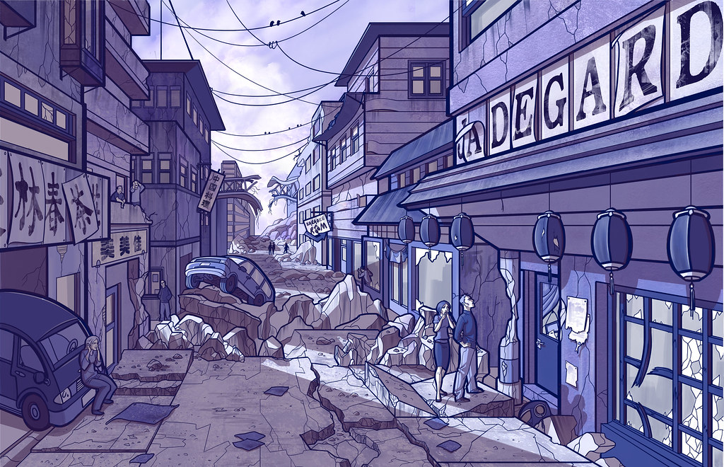
I'm away from home, which means away from my Cintiq. It's funny, I've worked for years with my trusty Intuos 3 tablet, and now 3 months with a Cintiq ruins everything. Working with the Intuos feels like an incredible chore now, which is ridiculous and probably one of those first world problems you hear about.

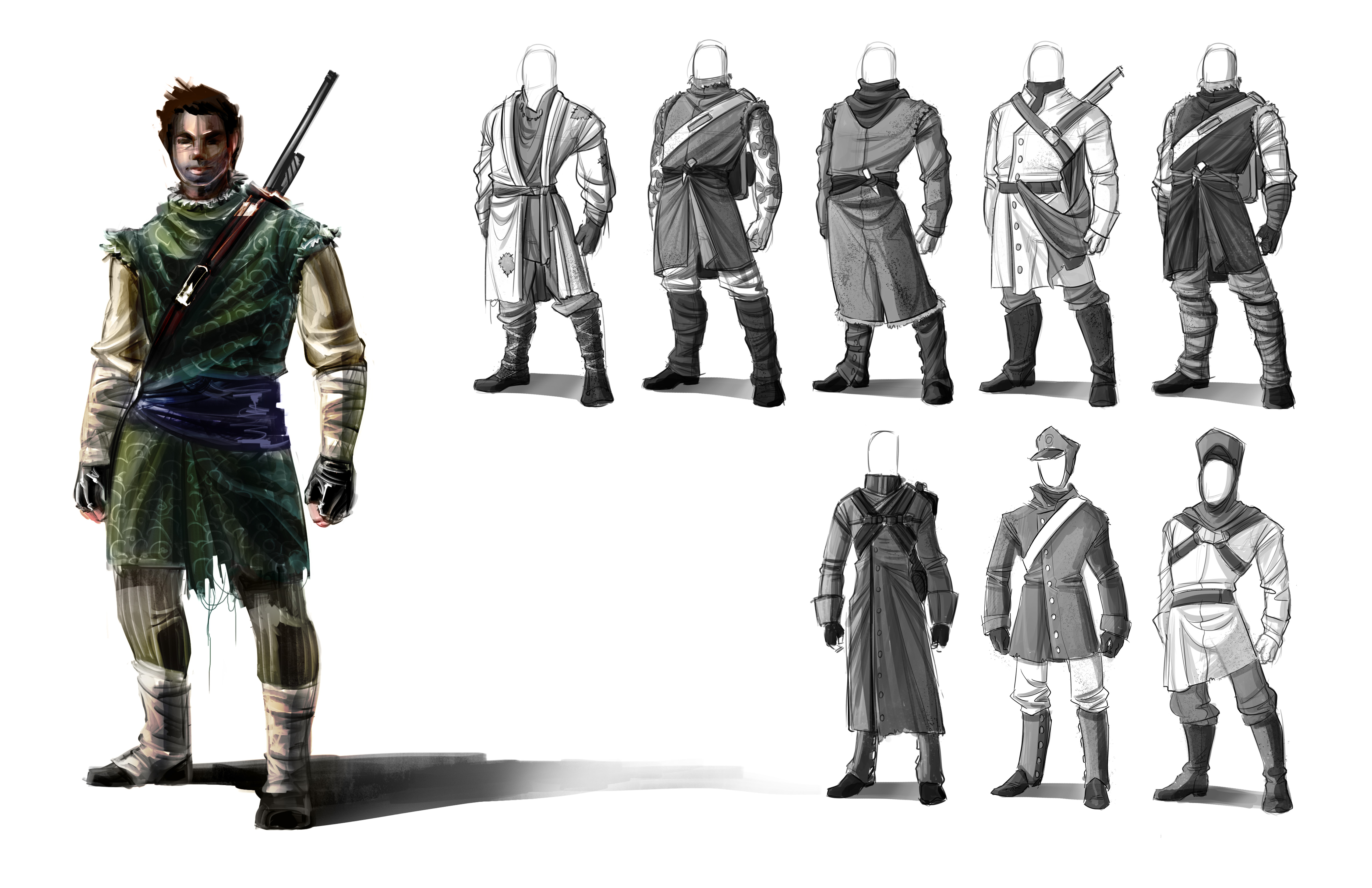
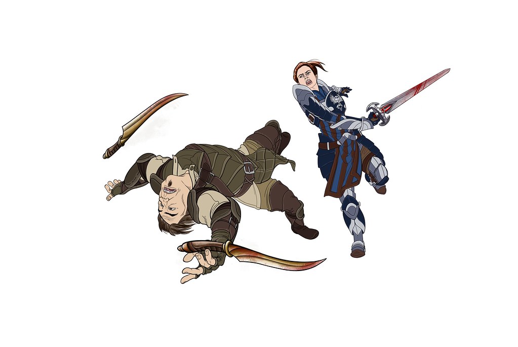
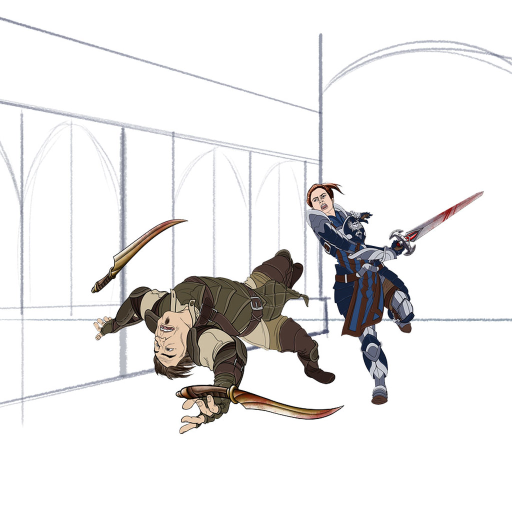
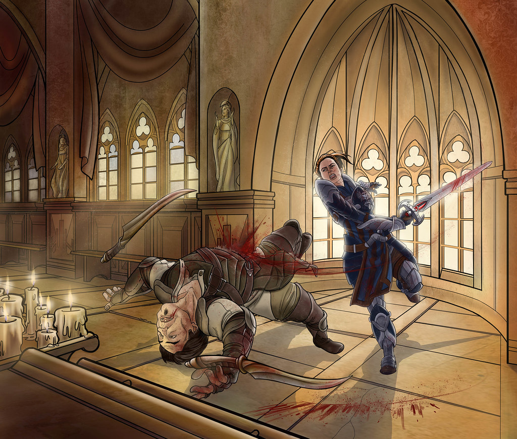
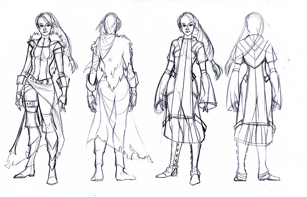
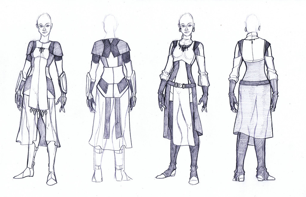
I've been working on a female character in the same vein as my male design for Donovan down below. I wanted to do something fantasy, so I decided to do a mage, mostly because mage clothing in games always bothers me. Usually it's some sort of ridiculous robe, dress, gown or something. To me, even if you are a mage I'd still think in battle you'd want to move around. Just because you can shoot lightning out of your hand/staff/face doesn't mean agility isn't important when people are trying to murder you. Also, there's hardly any armor for mages. I know that you have magic, but there's nothing wrong with a little something between you and a sharp stick, right? I mean, this is battle we're talking about. Things like that have always gotten to me, so I decided to pursue some options.

Oh, also - it's a huge pet peeve of mine that women aren't fully clothed in games, so it should go without saying that we're going to do a clothed female character, not a cleavage babe in thigh highs. It will never cease to amaze me the things lady characters wear into battle. But I could talk about that for paragraphs, so let's just move along shall we?

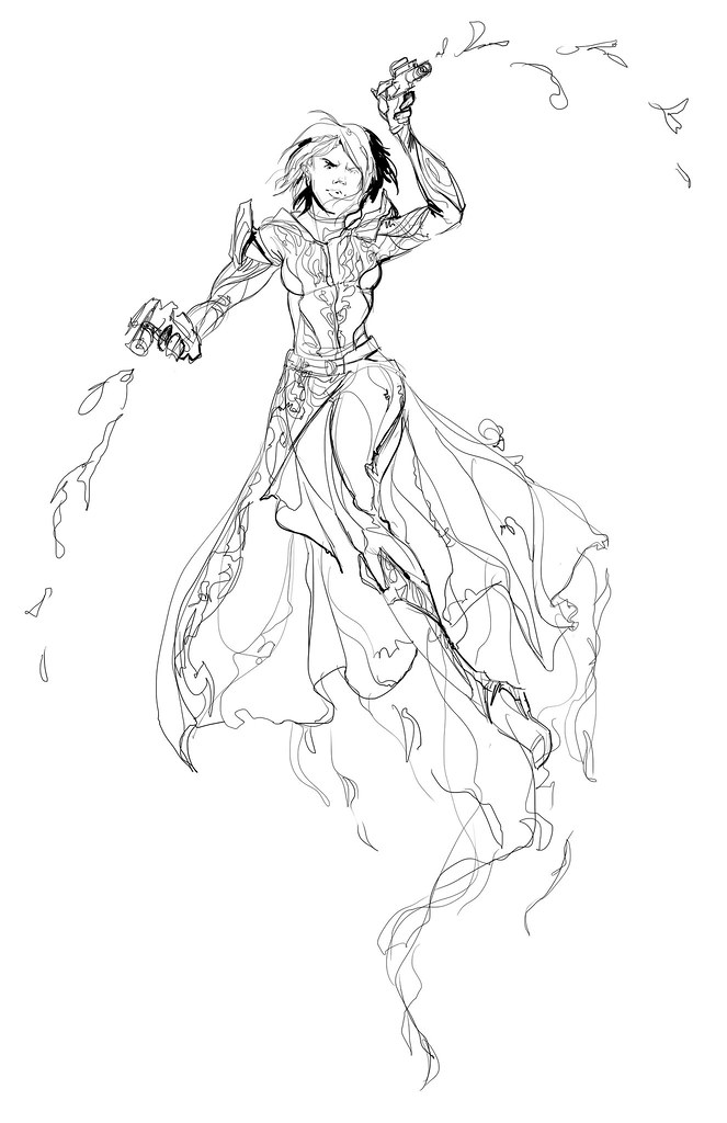
My process for this was different than with Donovan because a mage by class tends to have his/her role a little more defined. I saw this as your sort of starting archetype female character for an MMO. If it was for a story I'd say that this is a practical, battle-hardened type of person - serious and seasoned. I dislike the archetype that mages need to be frail sensitive people that cringe on the outskirts of battle for fear of breaking a nail.

I did some costume concepts:


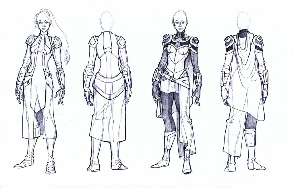
I'd like to do multiples in color like I did with Donovan, but I've had a lot of side projects on my plate lately. So for right now I picked one that I liked best, an amalgamation of a few designs, but primarily taken from the right image of the second set. I picked that design because I felt like it was practical, but the silhouette still read as a mage. What's more, even though there are drapey elements to the design, the outfit would allow for movement, while still theoretically still providing some protection.

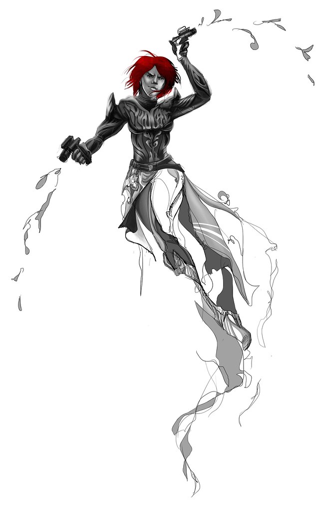
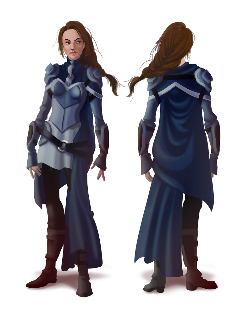
I went for a bright blizzard style color scheme:


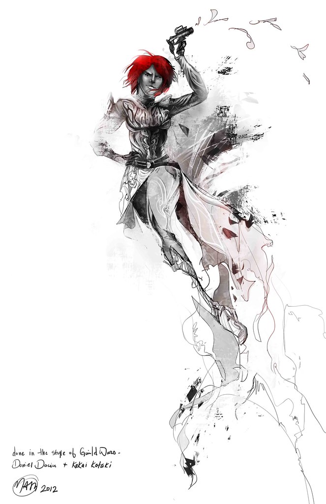
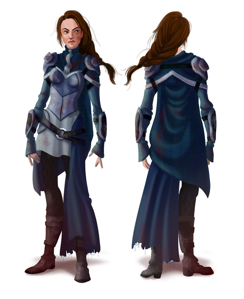
And then I added textures and scraped/scuffed it up so it looked like it wasn't fresh off the hangar at the Mage Surplus:

Voila! Job done. For now, at least.