So.... I'm behind on my schedule. Not too far behind, but the schedule is pretty demanding, so being even a little behind is not so good. However I am still plugging away! I haven't been able to do morning paintings this week because... I've been going insane. Also I've been trying to catch up on the aforementioned portfolio schedule, so I decided to break from the 2 hours paintings for the week. Class has been pretty demanding, but I don't think I can afford to let my personal goals slide. Oil painting is a good skill with a lot that translates to digital painting, but working to strengthen my core skill set is still most important to me. After all, going to graduate school is just silly if I don't use what I'm learning to improve the skills I need to succeed in the industry.
The past few days I've been focusing on doing monsters. I started with a lot of thumbs and pencil drawings. I haven't scanned them all, but I went through what I had and selected one that I thought had most potential. Before I started I made a list of things I think are frightening. I thought about things that I would be scared of in a game sense, but also things that frighten me on a personal level. Things I came up with included:
Things that are unnaturally fast.
Things that are difficult to see.
Things that want to eat you more than kill you.
Things that were human but have been warped unnaturally.
I think on a base level the reason we see monsters in games with human characteristics stems from more than just the idea that it's easy to rig things with identical base meshes. (Ok that is probably part of it too) It stems from a fear of what is inside of us, of what we could become in a nightmare scenario. You look at say, a zombie - not everything that makes zombies scary is the fact that they're gross or out for your brain, it's also that it could be you. If things were different you could be on the receiving end of that shotgun. It's things like this that I believe touch the base emotions inside all of us.
Here is my starting sketch:
I went more for the warped human than the unnaturally fast in this monster. I did keep the idea that it wants to eat you, and my original vision was that it would be wreathed in an paranormal darkness. there are human aspects, but it's definitely been messed with, like it was half eaten and infected with disease. The weird thing about monsters is that everything about them in my mind is supposed to be horrifying, so when making one I had to focus on making sure everything tied together with that theme.
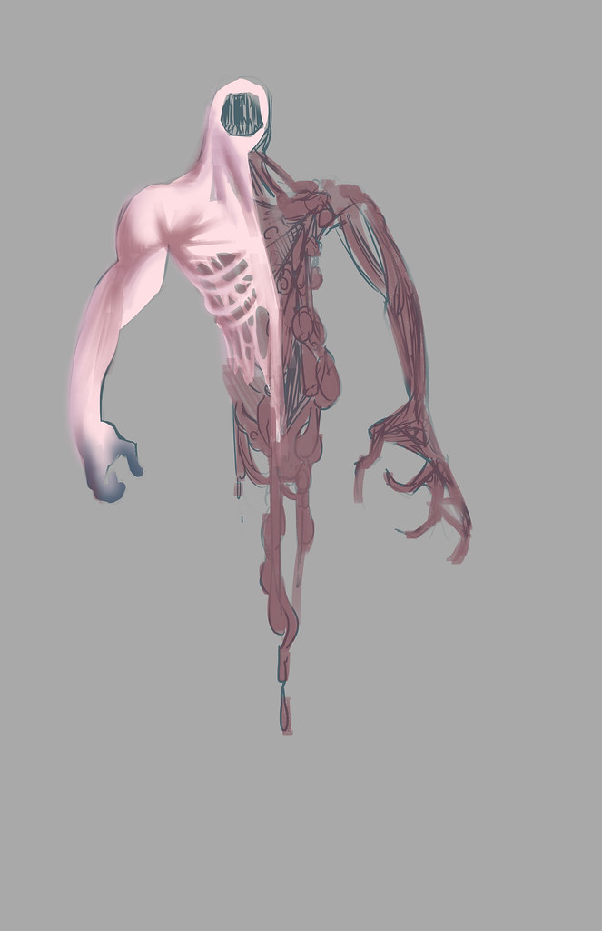
It's unfair to go further without giving some credit to Colin Fix. I've been inspired by his work and there is no way I can deny that seeing his paintings has influenced what I did here. I went for flesh tone, but bleached out, like it's dead and been in the dark for too long. I went towards blue on the "human" side to further push that feeling. One side is less mangled and more power based, the other side is all gore and about brute force.
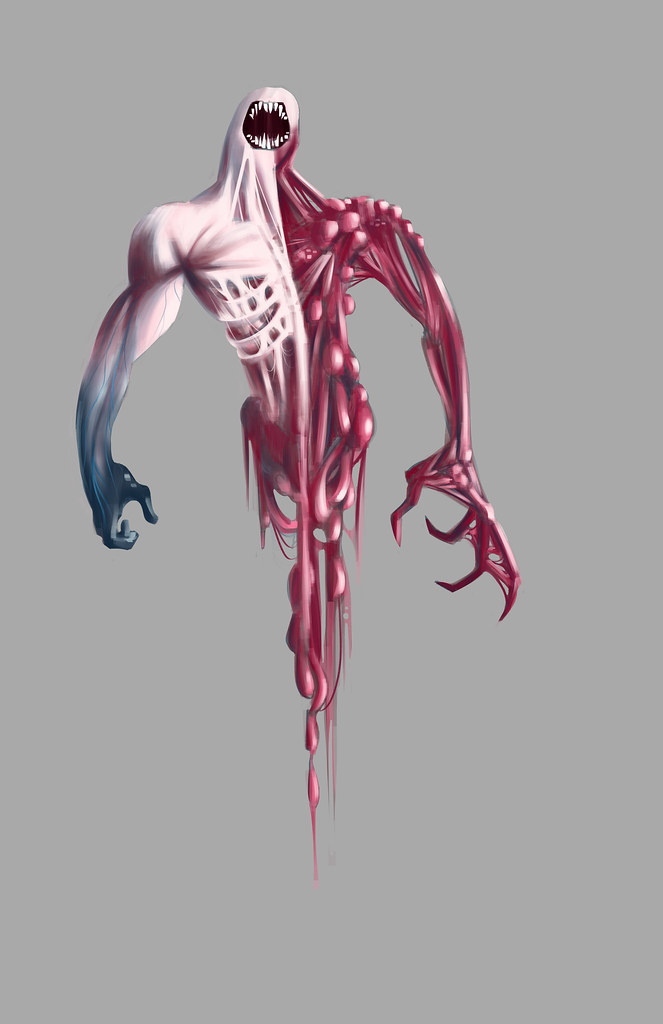
Getting into more detail now. I pushed the bright colors because 1) I think gore is messy and the brighter it is the more jarring the impact and 2) I think there are just too many monochrome monsters out there that are all browns and greens. Also I'm working to make the flesh more translucent on the left side.
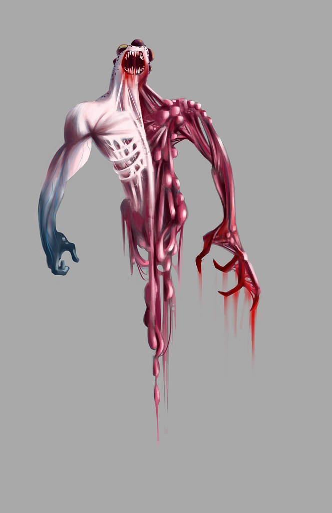
I added eyes, if you can call them that... they are supposed to be sort of dark membrane sacks. I'm not perfectly pleased how they came out, but they look all right. I also started adding actual gore to show that he eats people and he uses the clawed right hand to do it.
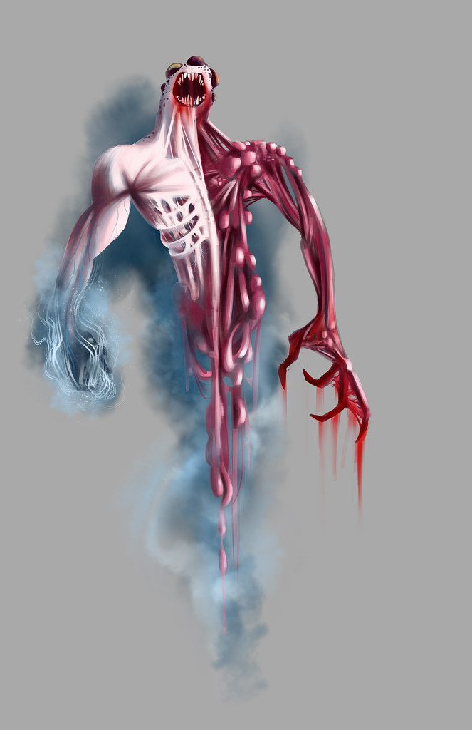
Not perfectly sure if this is finished, I think I will definitely come back to it. I added a smoky shroud to it to give the sense that it floats through unnatural means. I see the left hand as having some sort of power, probably which it uses to incapacitate prey. Still I don't like how much it obscures the hand, there needs to be a better way to depict this. Also I want to come back to make the right side more sinewy, I feel like there is too much brightness on some of the boils so it's drawing attention to them and making it look like bubble gum balls or something :) But there are aspects to this that I'm proud of for sure. Considering that I haven't done monsters up to this point it was a good first attempt. I will keep working.
Friday, July 1, 2011
Tuesday, June 28, 2011
ALIENS!
No scene painting yesterday (Saturday) because I went to the pride parade and that took up a chunk of my morning. Pretty intense, I haven't seen that much man junk since I took life drawing. Then today, I wanted to take some time and finish one of my personal assignments for my portfolio. It's not done in that I haven't done the male version in polish yet, but I thought I'd post what I have for the time being.
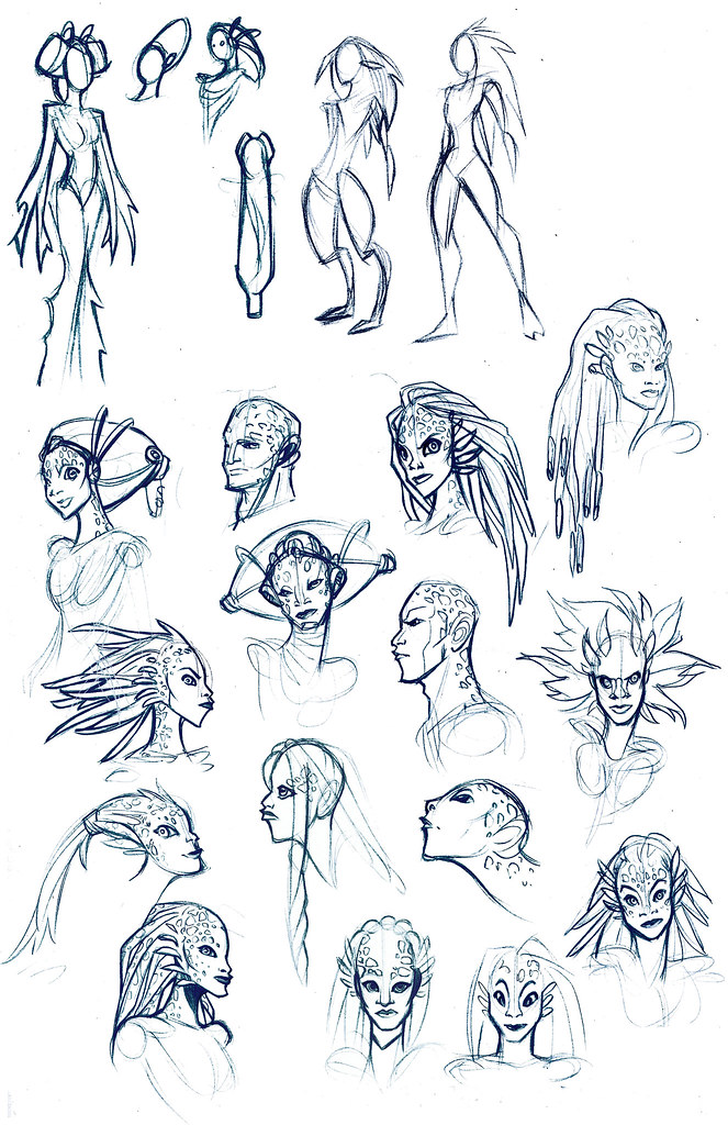
One of the things on my list that I'm working on this summer for my portfolio is to design a humanoid alien race. I've been working on it all last week and I narrowed in on what I wanted until I was pretty happy with the concept. Where I started was that I wanted a race that would be suitable for a game and would be something that players would find attractive, so it needed to have humanoid characteristics while still being alien. This was the rough framework. From there I started looking at pictures of different animals. I ended up with a lionfish and a mudskipper and thought it would be a fun idea to have an aquatic species that appeared to be in the process of evolving from water to land. I threw in a little octopus to keep it aquatic and push the alien side. Here are some of my concept sketches:
Lots of suction cups, camouflage markings, webbed digits etc. I threw in a tail because I thought it pushed the whole evolution-in-process idea. At the same time I kept the silhouettes very idealized human. As I worked I developed a concept for the race as a whole:
These people were exposed to space flight by other alien cultures, they didn't invent the means to travel off world themselves. Their society is tribal and it was determined that no male of the species would lower himself to leave the world to parlay with the interlopers, so the females became delegates for the species. This has become extremely attractive to the females of the species, who enjoy a sort of empowerment off world. Many do not return. Males generally only leave if exiled.
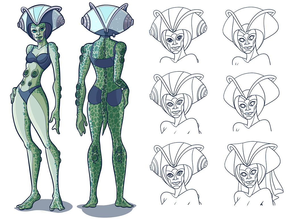
While the species can exist for short periods outside of water, for prolonged periods of time they need to either undergo surgery to adapt their lungs to oxygen or wear head pieces. These head pieces serve two purposes: they recycle and filter water to allow their gills to breathe and they also provide an environment for their kelp-like hair. If the hair fully dries, the follicles will seal and the hair will never grow again, so the head piece is necessary if they wish to retain their hair. Because it is taboo, if a male leaves he shaves his head and adapts his lungs as a rite immediately, knowing he can never return. For females to cut one's hair is unthinkable, it would be like going native in the worst way. Women of the species are usually very proud and outgoing off world, probably as a counter to their oppressive culture.
Finally I played with different costumes and color schemes for clothing. Because of how proud they are, I thought bright colors would be best. These are not intended to be clothing for the culture, but rather off world clothing shared by a mix of alien societies. The center is my favorite. I wanted a look that was sexy but also strong and proud.
They are still a work in progress, but they are coming along.
One of the things on my list that I'm working on this summer for my portfolio is to design a humanoid alien race. I've been working on it all last week and I narrowed in on what I wanted until I was pretty happy with the concept. Where I started was that I wanted a race that would be suitable for a game and would be something that players would find attractive, so it needed to have humanoid characteristics while still being alien. This was the rough framework. From there I started looking at pictures of different animals. I ended up with a lionfish and a mudskipper and thought it would be a fun idea to have an aquatic species that appeared to be in the process of evolving from water to land. I threw in a little octopus to keep it aquatic and push the alien side. Here are some of my concept sketches:
Lots of suction cups, camouflage markings, webbed digits etc. I threw in a tail because I thought it pushed the whole evolution-in-process idea. At the same time I kept the silhouettes very idealized human. As I worked I developed a concept for the race as a whole:
These people were exposed to space flight by other alien cultures, they didn't invent the means to travel off world themselves. Their society is tribal and it was determined that no male of the species would lower himself to leave the world to parlay with the interlopers, so the females became delegates for the species. This has become extremely attractive to the females of the species, who enjoy a sort of empowerment off world. Many do not return. Males generally only leave if exiled.
While the species can exist for short periods outside of water, for prolonged periods of time they need to either undergo surgery to adapt their lungs to oxygen or wear head pieces. These head pieces serve two purposes: they recycle and filter water to allow their gills to breathe and they also provide an environment for their kelp-like hair. If the hair fully dries, the follicles will seal and the hair will never grow again, so the head piece is necessary if they wish to retain their hair. Because it is taboo, if a male leaves he shaves his head and adapts his lungs as a rite immediately, knowing he can never return. For females to cut one's hair is unthinkable, it would be like going native in the worst way. Women of the species are usually very proud and outgoing off world, probably as a counter to their oppressive culture.
Once I decided on the general look, I went through several types of eye shapes and head pieces. I worked on the coloring, I wanted something aquatic, but not too stereotypically aquatic, so I went more for green than blue. I ended up with a look that is somewhat salamander-esque. The body is covered in markings and suction cups. For the eyes I wanted something large like a fish, but still not creepy looking. Despite trying a number of shapes I went for something pretty human, just because straying too far made her look odd and unattractive.
Finally I played with different costumes and color schemes for clothing. Because of how proud they are, I thought bright colors would be best. These are not intended to be clothing for the culture, but rather off world clothing shared by a mix of alien societies. The center is my favorite. I wanted a look that was sexy but also strong and proud.
They are still a work in progress, but they are coming along.
Saturday, June 25, 2011
Drawing for 6/25
Staying away from leaves again today... decided to do a city skyline. I'm still in a sci-fi mood, but there isn't anything exactly overtly sci-fi about the finished piece.
I started with this image:
...And my finished drawing:
It took about... 2 1/2 hours I think. The photo was really just a jumping off point. In retrospect I could have probably lowered the whole thing a bit to show less water and more sky. I also used a lot of different colors... I went back and forth about maybe making the colors a little more within the same scheme, but in the end I thought the variety of colors gave it less of a polished futuristic "star trek" look and more of a realistic bladerunner type look. As Tim Gunn would say, it's a lotta look.
I started with this image:
| "Skylines" by sanchom |
...And my finished drawing:
| Night time. |
It took about... 2 1/2 hours I think. The photo was really just a jumping off point. In retrospect I could have probably lowered the whole thing a bit to show less water and more sky. I also used a lot of different colors... I went back and forth about maybe making the colors a little more within the same scheme, but in the end I thought the variety of colors gave it less of a polished futuristic "star trek" look and more of a realistic bladerunner type look. As Tim Gunn would say, it's a lotta look.
Friday, June 24, 2011
Must... keep... drawing (Drawing for 6/24)
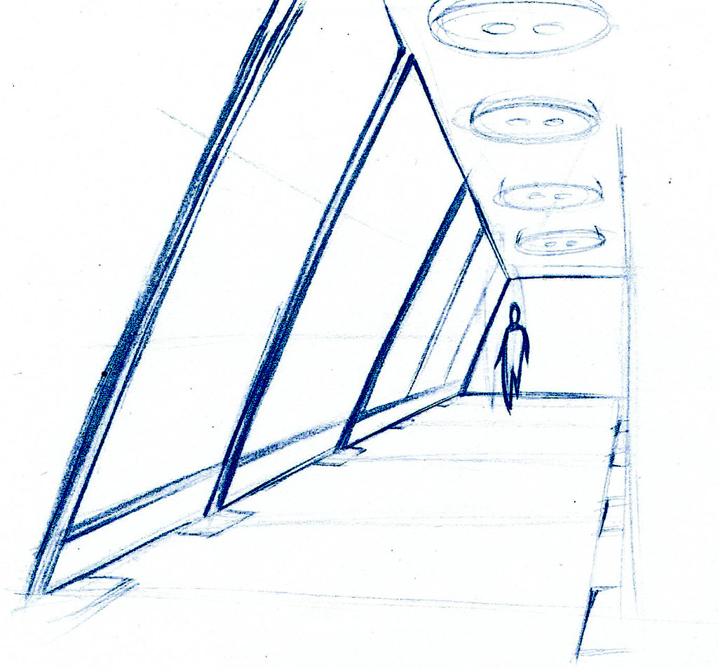
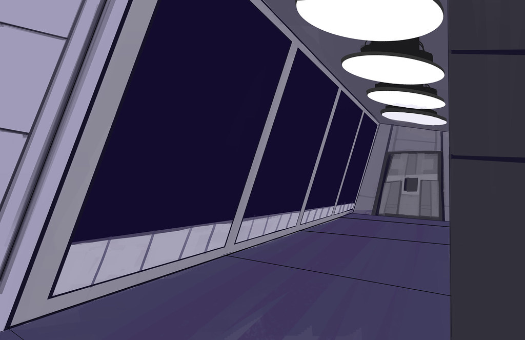
Something a little different today... I decided to do a drawing from a thumbnail I sketched last night. I always keep paper on my desk, so when I'm doing stuff on the computer I can doodle, like while mail loads or during a game cutscene. I did a little sketch of a corridor and thought it would be a fun thing to try for my drawing today. Also it put composition totally in my hands, which was good for a change.
The sketch:
I liked the angled windows, I thought it looked sort of futuristic. I didn't use any real references, just some different concept art pieces to look at how people applied brush strokes, nothing huge. I did start differently though - given how geometric it was I decided to do some hard lines in black down first.
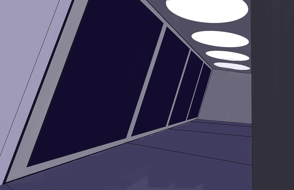
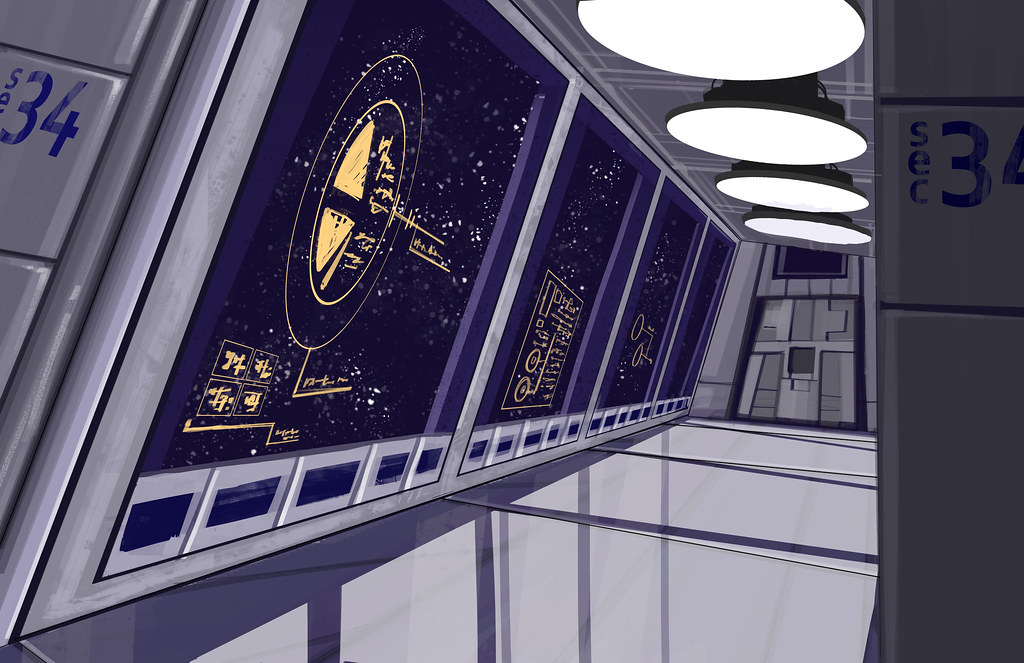
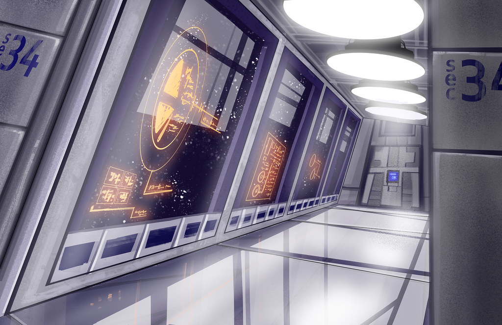
Then I just sort of went for it from imagination. I've played a lot of sci-fi games so I just drew off my impressions of what I thought an observatory type deck could look like.
It was a nice break not trying to copy anything. I think the fun I had came through in the end result. And there wasn't any freaking leaves! Sometimes children, we just need to put the leaves away. For a little while.
The concept was an observation corridor on a space station or ship. I thought using the windows to project information would be fun, so if you were looking out the window it would help you observe star data or orbital information or what have you. Maybe you could just browse youtube. I don't know. :) I think it came out reasonably well.
The sketch:
| Simple, but it has potential. |
I liked the angled windows, I thought it looked sort of futuristic. I didn't use any real references, just some different concept art pieces to look at how people applied brush strokes, nothing huge. I did start differently though - given how geometric it was I decided to do some hard lines in black down first.
| No, it's not vector. Don't insult me. |
| Working in gradually. The scariest stage for me. |
| Details are where the fun starts. |
| It's sci-fi, so we'll shine it up a bit. |
The concept was an observation corridor on a space station or ship. I thought using the windows to project information would be fun, so if you were looking out the window it would help you observe star data or orbital information or what have you. Maybe you could just browse youtube. I don't know. :) I think it came out reasonably well.
Thursday, June 23, 2011
Drawing for 6/22-6/23
Summer class has completely destroyed my schedule. I need to figure out a new system to arrange my time... the modules for my class are periods of three days, so each three days I have to write a lot and do a painting with oil paint, plus find time to work on a long term assignment. Combine that with my desire to do a digital painting each morning and my weekly personal projects and it's been easy to feel overwhelmed. Still, I think all of it is important, so I don't want to remove anything, I think I just need to find a new way to distribute my time. I'm testing out a new schedule right now.
In the meantime, here is a three-ish hour drawing I did over the last two days. I... don't like it much. I over complicate things color-wise and composition-wise. Maybe it's because I'm so busy and am having trouble focusing. It disappoints me when I finish a drawing that I don't feel worked out so well. Anyway, it was based off this photo:
And the drawing looks like this:
It just feels... I don't know. I feel like I'm overworking, doing way too many strokes and getting a messy result. I also think I need to invest more time in the planning stage to make sure my foundation is correct on a perspective basis. I think I'm cutting corners in the wrong way and getting stoppy. Also the colors aren't my favorite. There is a fine line between making fast strokes and making sloppy strokes. Also there IS such a thing as good contrast and bad contrast. Here's an example for nice contrast in a concept piece:
See that? That's nice. The strokes are simple and there isn't a lot of specific defining brush work, but the whole thing just feels clear. The contrast between warms and cools is really good, striking but not jarring. This is something I'm trying to improve on, but it's so daunting.
I was talking to a friend last night and when I was thinking about it I couldn't think of any prominent concept artists who are women. I wonder why that is. Also, when you find prominent women in design fields it feels like their work tends to be cute or charming in the style. It's something to think about... it annoys me and makes me want to work harder.
In the meantime, here is a three-ish hour drawing I did over the last two days. I... don't like it much. I over complicate things color-wise and composition-wise. Maybe it's because I'm so busy and am having trouble focusing. It disappoints me when I finish a drawing that I don't feel worked out so well. Anyway, it was based off this photo:
| "Ruins at Angkor" by kangotravelor |
And the drawing looks like this:
| Hmm. |
![]() |
| Art by Levi Hopkins |
I was talking to a friend last night and when I was thinking about it I couldn't think of any prominent concept artists who are women. I wonder why that is. Also, when you find prominent women in design fields it feels like their work tends to be cute or charming in the style. It's something to think about... it annoys me and makes me want to work harder.
Tuesday, June 21, 2011
Drawing for 6/21
Well, summer class has started. As expected it's going to be sort of rough and require a lot of time management to do it AND my summer goals. But I'm still going to do my best. Maybe if I can establish some efficient work ethic I can carry it into the fall semester and keep improving in the areas I care about outside of my classwork. I'd hoped in grad school that I would get more opportunities to focus in specific areas I want to improve in... while there are more opportunities than when I was an undergrad, there aren't as many as I'd hoped. I'm going to just work really hard to learn what I need myself and try not worry about my grades; as long as I'm getting benefit out of the courses that's what matters.
I am going to need to be really insane with the time management though. I'm going to try to bring the daily drawings down to 2 hours or so instead of 3. Today's was a 2 hour drawing inspired by this image:
I didn't do my drawing based off the whole image, just a portion of it:
It came out ok... I think I've been staring at it for a solid 2 hours so I don't like it as much right now. The rocks in the water turned out reasonably well. I feel like in drawings with lots of vegetation things can start feeling a little muddled, but when I look at it close up it seems pretty clear. There is a lot of blue in it though.
I am going to need to be really insane with the time management though. I'm going to try to bring the daily drawings down to 2 hours or so instead of 3. Today's was a 2 hour drawing inspired by this image:
| "Peace Park Cliff Bottom" by chrissam42 |
I didn't do my drawing based off the whole image, just a portion of it:
| Finished 2 hour drawing |
It came out ok... I think I've been staring at it for a solid 2 hours so I don't like it as much right now. The rocks in the water turned out reasonably well. I feel like in drawings with lots of vegetation things can start feeling a little muddled, but when I look at it close up it seems pretty clear. There is a lot of blue in it though.
Monday, June 20, 2011
Some sketches
I've been working on some things, but not a lot is coming out well today. That shouldn't matter but it's been a weird couple of days and I've been having trouble being motivated. Even when I do stuff it's all been a little discouraging. Ah well, will try to get back on the horse.
I did some sketches of some wood... which sounds weird. But they are sort of interesting I guess.
Also I colored the guns from the other day:
The... stripes make them shoot faster...
I did some sketches of some wood... which sounds weird. But they are sort of interesting I guess.
| Tree house! |
| With grit. And racing stripes. |
The... stripes make them shoot faster...
Subscribe to:
Posts (Atom)