Saturday, January 21, 2012

Various stuff

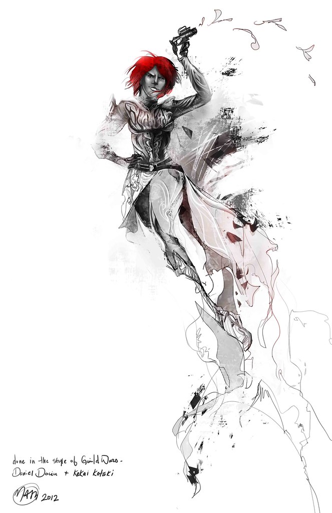
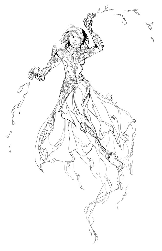
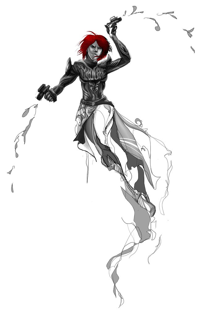
I've been trying to experiment and do some different things lately. I got inspired by Guild Wars promotional art and decided to take a look at the images and see if I could do something from scratch that was similar. I never work this way, so I'd say the drawing took 4-5 hours with all that noodling I'm trying to stop doing.

Line
So I started with the line. It's way sketchier than I like to work, but I'm trying to loosen up a little and be more gestural.

Adding value
Then, while referencing the other GW promo images I looked at how and where the value was applied and started trying to mimic the style. I took out some of the line and started punching values in selective areas.

Texturing
I ended up altering the pose because the movement directions felt wrong. I'm not sure if this really works either, she feels kind of stiff now. After I got the intensity of the values the way that I wanted I went in and added texture elements like I saw in the GW images. Overall I'm pretty happy. It was a fun experiment.


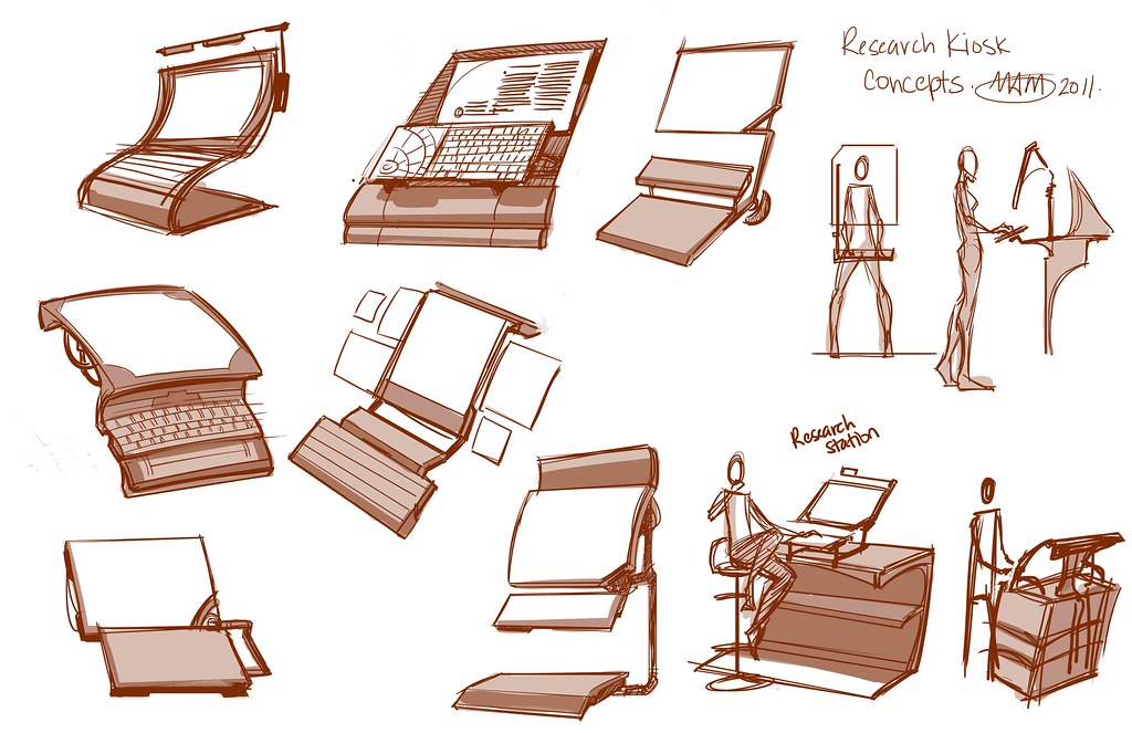
I've also been doing some props stuff lately. Here are some research kiosk designs I've been working on:


Digital Paintings

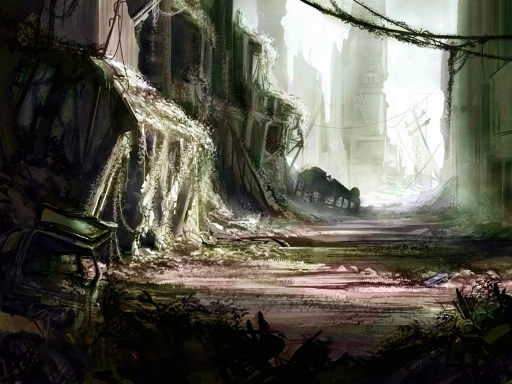
I've done a few environment paintings over the winter break. I try to keep things short (3-4 hours) but I find I end up nit picking and noodling over them. It's a bad habit and I think it makes things look overworked. I'm trying to cut it out and be more efficient. Still, here are some progressions on recent paintings:


I actually really like the colors here, although it's a bit like an oil slick.


I've been really trying to experiment with color. I have a pet peeve with all the gritty realism I've seen in recent years, so I've been trying to create sort of a heightened realism where things look realistic but with slightly more saturated colors. I've been trying to play with color combinations and create ambiance through color choice. Sometimes it ends up looking like a leprechaun urped rainbows all over the drawing, but other times I feel like it really adds something.

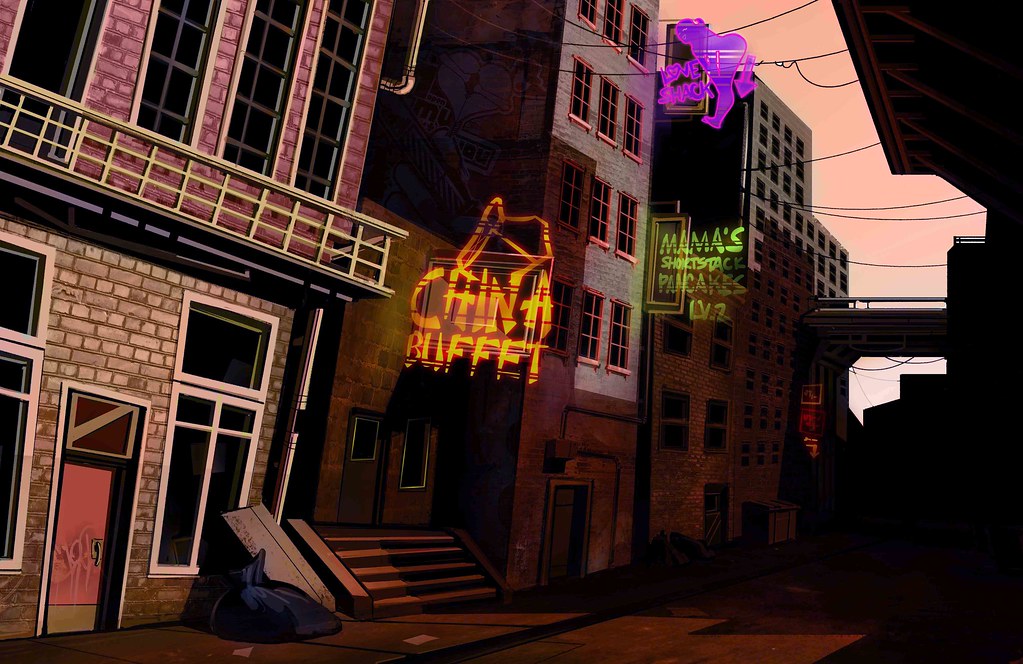
Here's a drawing I've been struggling with for color choice. I ended up putting it on the back burner, so it's technically not "finished" in my mind:

Color scheme 1: late afternoon
Color scheme 2: dusk
Color scheme 3: night
Each scheme changes things differently. I like the 2nd one the best because it has the widest range of color in it, but each one adds and detracts something. It's something I'm still trying to analyze and understand better.

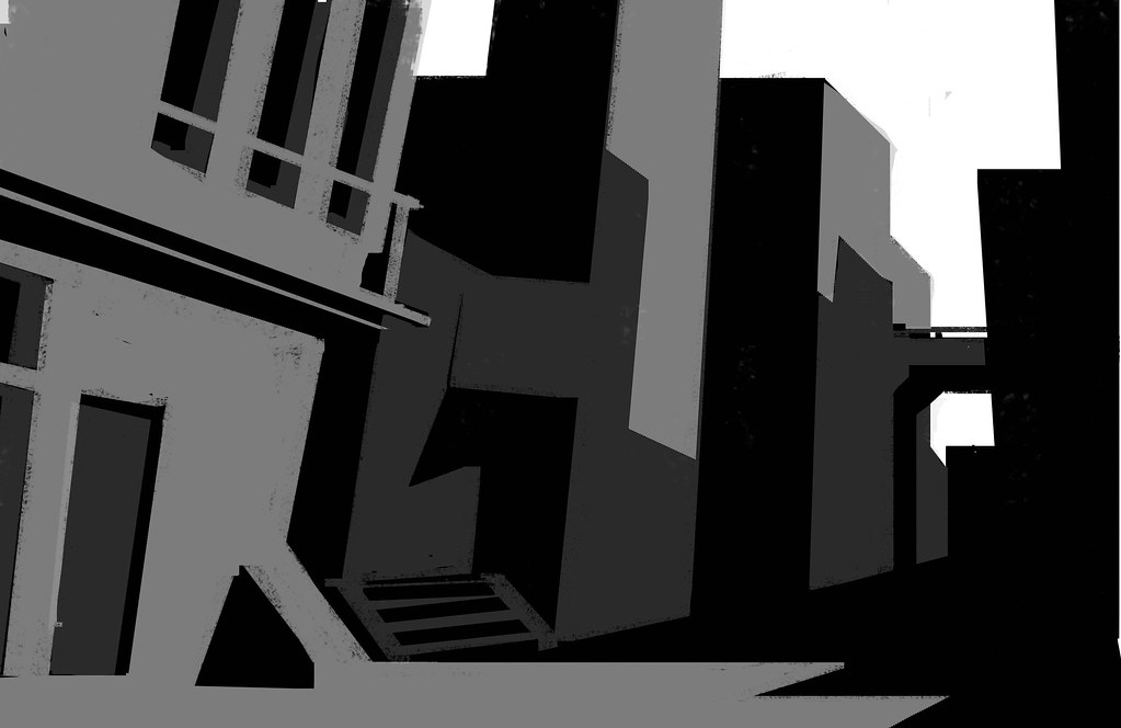
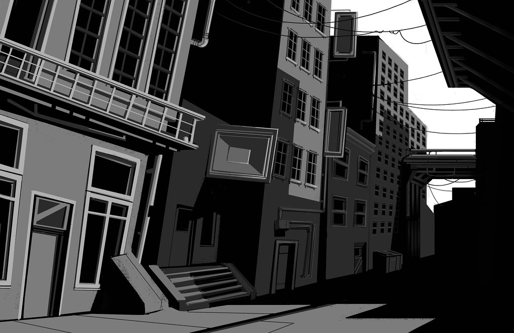
If you like thumbs, here was the progression for this one. Slightly different than my usual way:

Base thumb
More detail

Pastel drawing

It's been a while. I've been really busy drawing and less busy with updating.
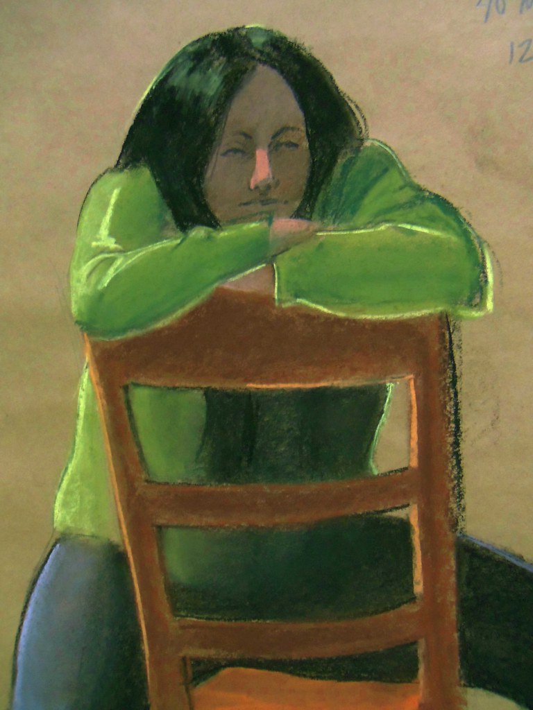
Here are some pastel drawings. These were 40 minute drawings from live models:


We get mostly female models, which is kind of limiting. Although I do really enjoy drawing women, so it's not a total loss. I have more of these up in my fine art flickr album. Drawing from life is really informative, but tiring. I also prefer digital because I don't like to get covered in mess. I know, that's pretty ridiculous isn't it? If you saw the state of my apartment you'd tell me it was obvious I have no aversion to mess whatsoever.

Monday, November 14, 2011

More 3 hour painting

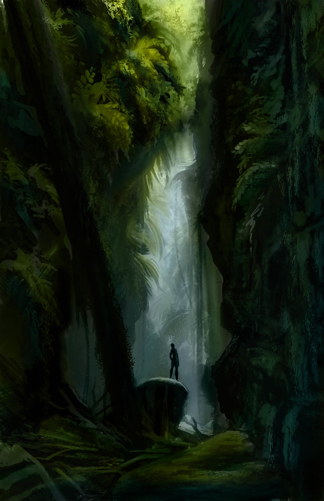
I love reddit. I have to be careful about going there, because it's a ridiculous black hole for productivity, but it can also be a great resource. There are subreddits for all kinds of interesting photos such as interiors, abandoned buildings, nature scenes and a lot of other incredible things.

I recently was rooting around in there when I found this national geographic cover:


I was really inspired, so I decided to do a painting of it:

It took two and a half hours. I'm pretty pleased with the end result. It's not exactly the same, but for the time spent I think it came out all right. I might revisit it later on and do some more with it.

The Warden Commander

I did a drawing recently of my grey warden from Dragon Age Origins. I don't do a lot of fan art, because I don't think it serves well for portfolio pieces, but I've always loved the scene where the human noble origin catches up with the man who murdered his/her family. It's a very cool story filled with high emotions, so I thought it was be a good scene to try illustrating.

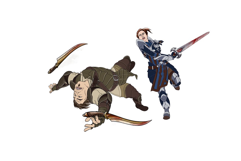
I'm really working on perspective, so I started with the main characters:
Just flat coloring to start, trying to get a sense of what colors I think would look good. I used a variety of references, as well as making up the things I thought would look cool. One of the things I love about concept art and illustration is being able to work with pre-existing concepts and pushing them to be as exciting or inspiring as possible. I'm glad I live alone, posing in front of a mirror with my swiffer to try and get the pose of whipping in a circle would have been pretty ridiculous with an audience.

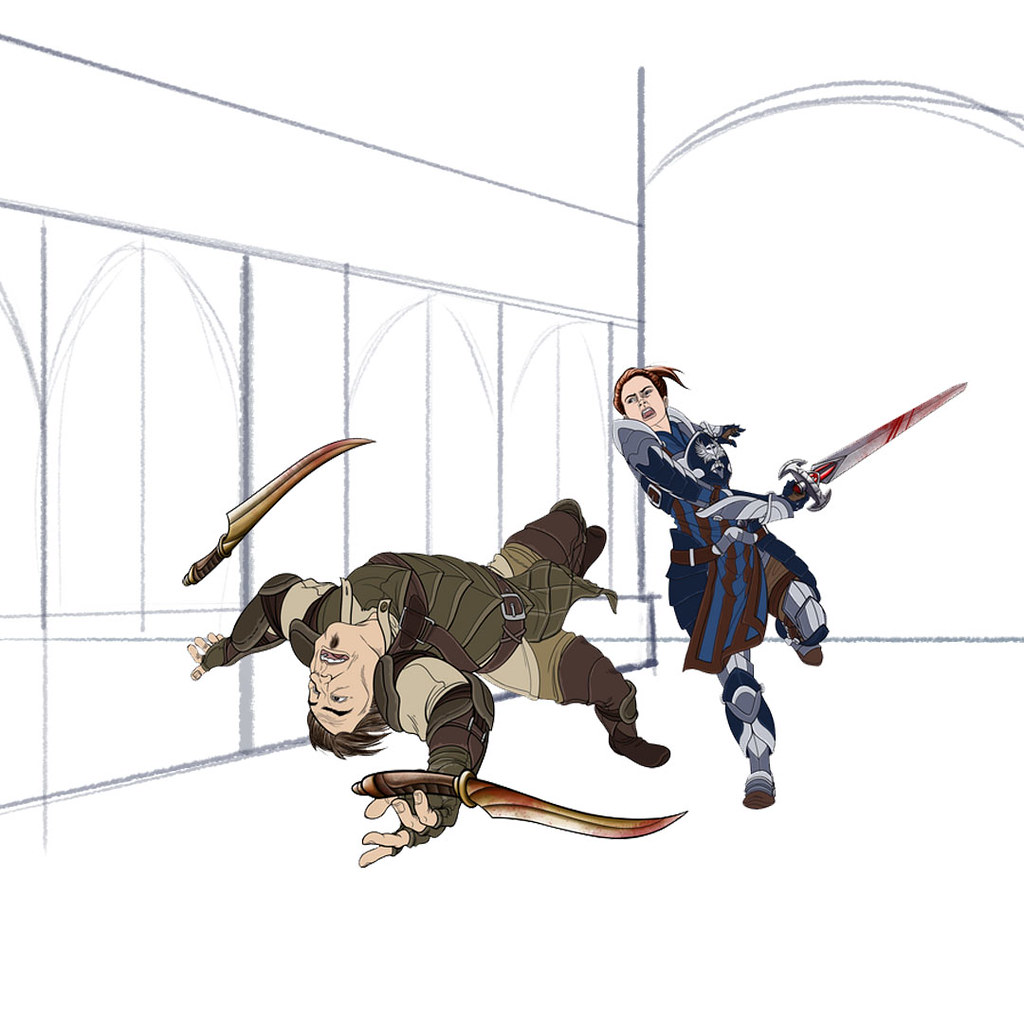
I just added this to show how it took me a while to figure out what sort of background was right. I initially intended to do the scene in a dungeon, because that is where it is set in the game. However, I ended up deciding to go with a different location that I thought would be more interesting.


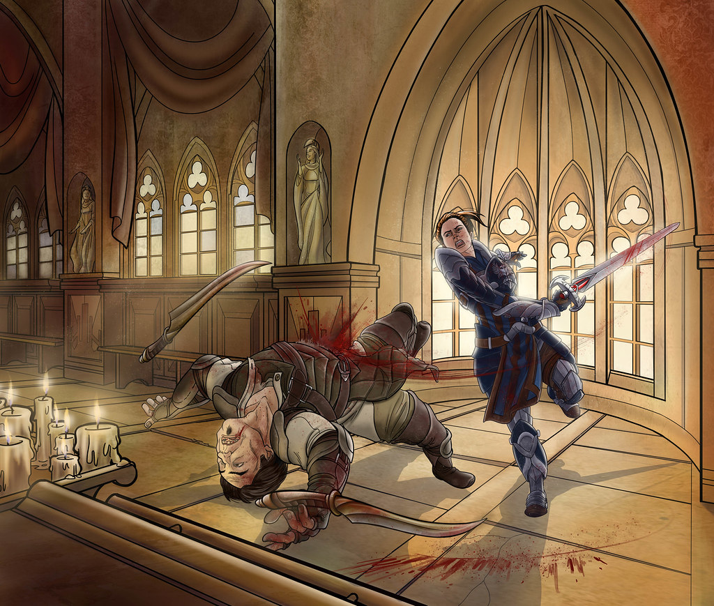
I set it in a chantry. It was fun making a variety of details and playing with light. I chose a chantry a) because it seemed like a cool place for a fight, but b) there is a lot of architecture to make my life miserable with perspective. Since I'm trying to push myself to sort things out, this was a good opportunity. The shadows here are wildly inaccurate.


Continuing to futz around. I made the table into a pew and that seems more natural for the setting. Messing with the shadows, but they still don't feel right. Other issues are that even though Howe is flying through the air, he still feels very close to the Warden. Since she's not traveling backwards, that just doesn't work. Also the windows behind her are behaving like they are on a flat wall, not on an elipse.


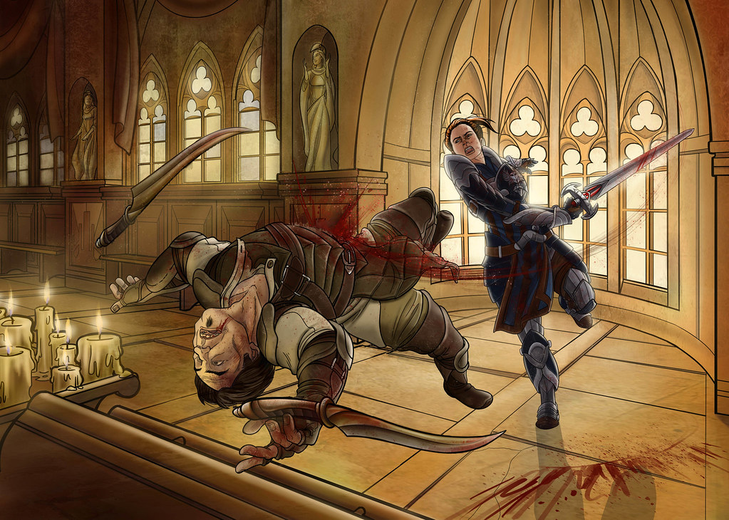
You're never really finished with something, you just have to decide when to throw in the towel. I adjusted Howe to make it look like he's really moving toward the viewer. I mapped the shadows from the light source and found that the reason they looked so wrong is from this angle you can't actually SEE his shadow at all. It looked a little odd, but I can't argue with math. I also fixed the windows, which is a relief to my eyes.

Overall I like it. I want to push harder to use less line in my work though, so I am disappointed in myself for falling into old habits. Must keep trying!
Thursday, November 3, 2011

Recent Work

I've been so busy with class and side projects lately that updating the blog hasn't been an enormous priority. But I thought I'd check in with a sampling of what I've been up to. If you check my Flickr page there won't be anything new, but here's some of what I've been doing:

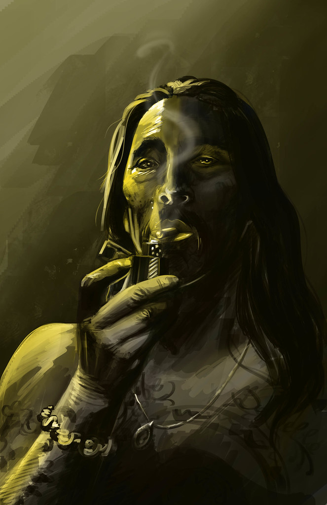
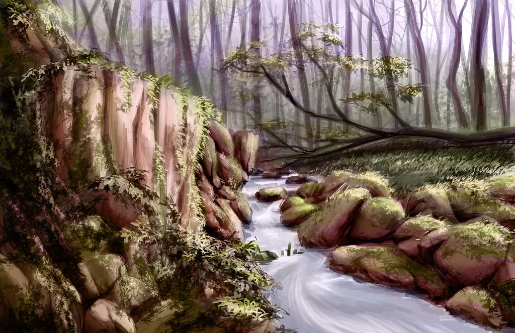
I'm starting up the three hour drawings again. I'm working from photos, but then trying to tweak and adapt them. This isn't something that comes to me naturally, so I've been making a concentrated effort to get past my fears and do my best, even if I'm not happy with the outcome.

The Tattooed Man
Forest Scene
I'm struggling with overworking and I want to make fewer more decisive brush strokes. Here's a process piece from the scene above that shows how I used the photo and expanded on it:
I wish I'd tweaked the composition more in the finished piece.
3 hours isn't a lot of time, so I need to work on cutting out my nitpicking and really focusing on what matters to get the most out of my time. Which is really part of the goal with a restricted time limit in the first place.

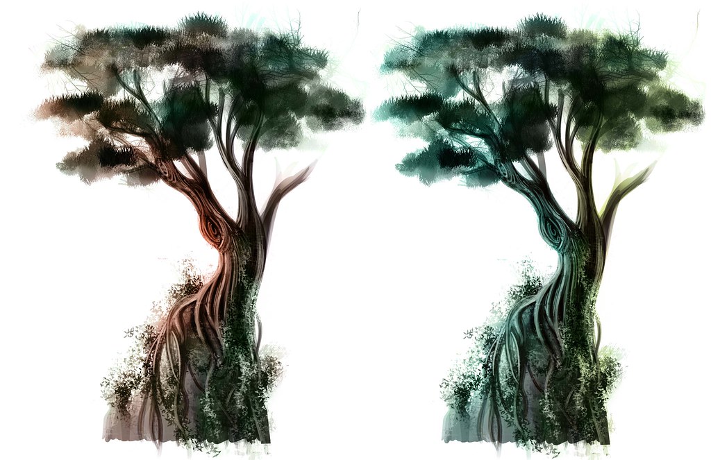
I've been working on practicing some different styles. I looked at some of the neat work from ArenaNet and I was inspired to do some trees on rocks. Certainly not the same as ArenaNet's, but it was something different.

I think that to make them better I should use less sweeping curves in the future, it makes them feel cartoonish.

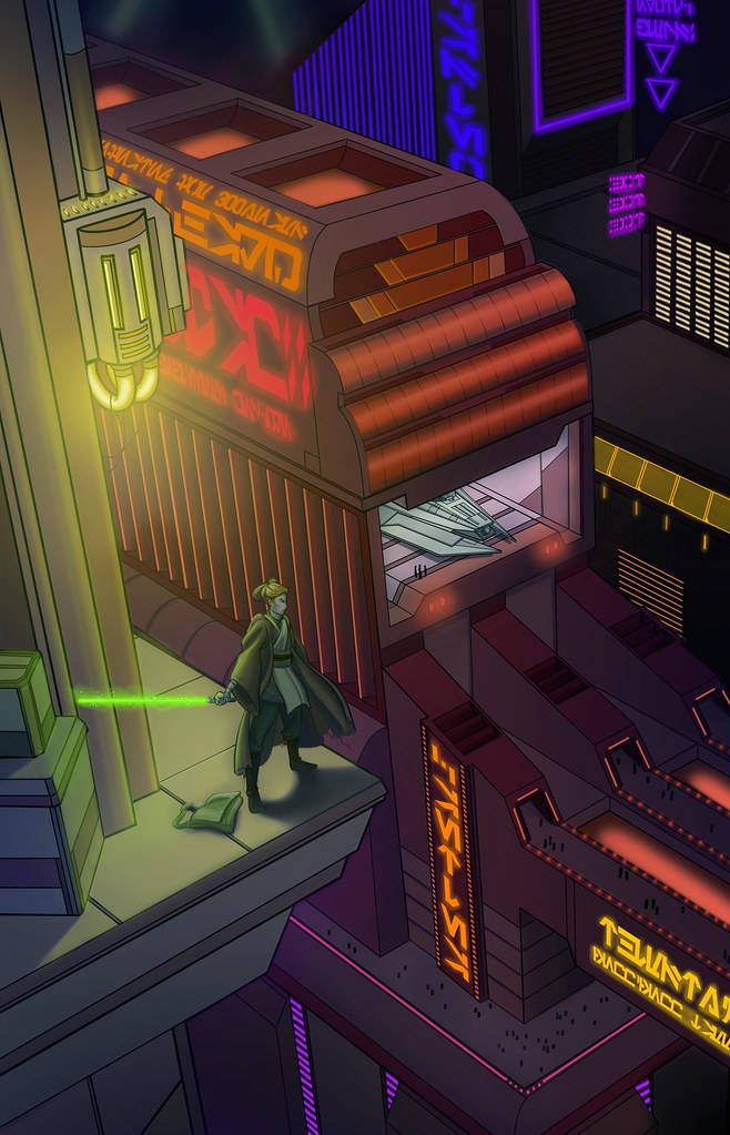
Here are some pieces that I've been working on for my perspective practice:


I need to work on more realism in the faces.
Cafe/ Secret Technological Base for my thesis proposal
Nar Shaddaa - I'm excited for the Old Republic.

And then here's an hour drawing I did from a live model in chalk. Chalk isn't my favorite, but I'm trying to improve. Faces are one of my current focuses, since I've drawn cartoony for too long and I'm trying to get away from that.


That's all for now.

Sunday, September 25, 2011

Rubble Rubble Everywhere

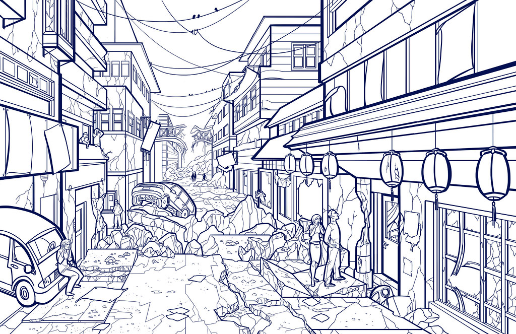
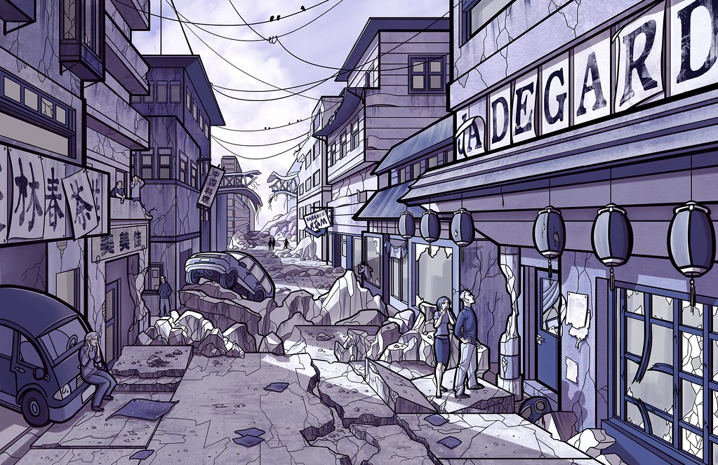
It's been a busy few weeks, so not a lot of time for exposition. I just finished a new drawing though, and it seems good for this space so I thought I'd put it up. I decided I'd do a street scene after maybe a bombing or an earthquake. So, I cooked up a line drawing for it:

I'm getting dizzy looking at those cracks.
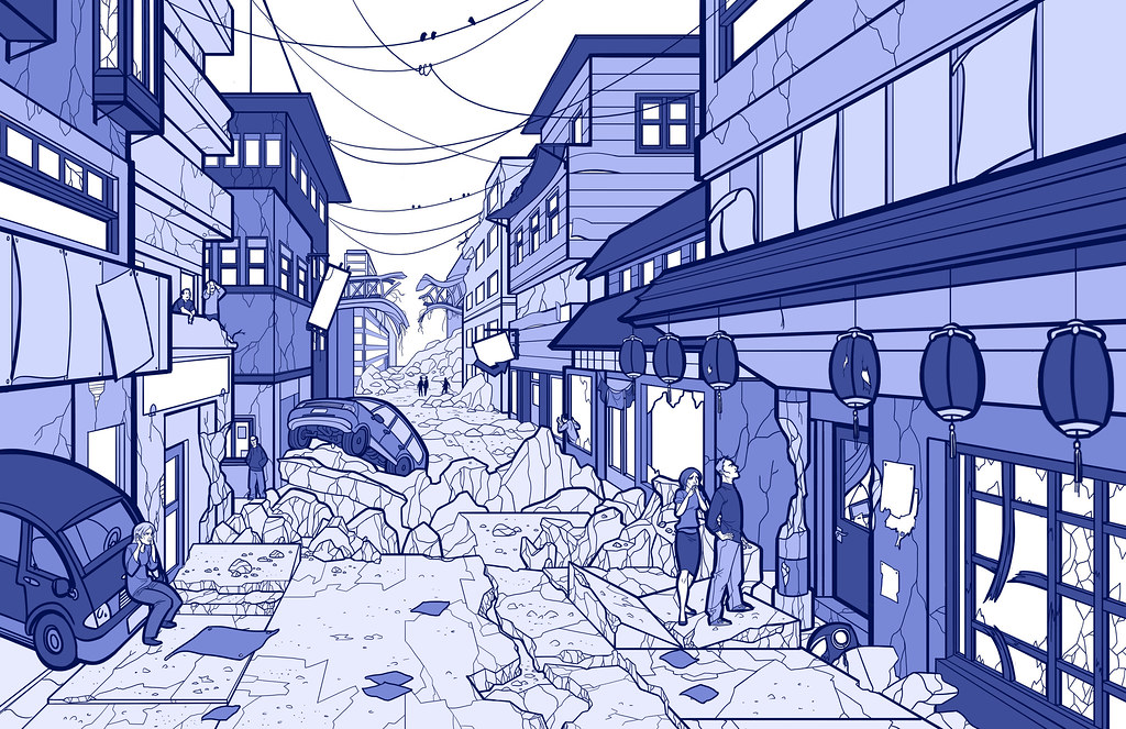
I do a lot of line drawing. but I've been really trying to push toward more realistic textured stuff. To make things simple I decided to just add one color hue for value, in blues:
Sort of intense, but I can work with it for now.
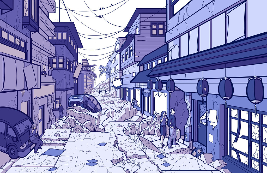
Once the base colors were down, I started adding in the shadows I knew would be there for certain, based on the light source I'd chosen. (It's in the upper left.)
I went with slightly redder shadows, just for contrast.
Then I plotted out the more complex shadows based on the precise position of the sun in relationship to the objects in the image. I also started planting secondary shadows and throwing in more texture to make it feel a little more realistic, as well as additional detail.
It's getting there, but it's still a little intense.
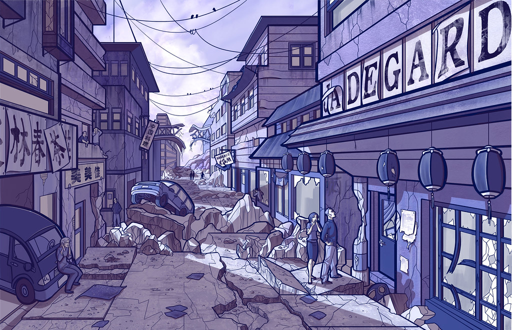
After I finished making sure the shadows were pretty accurate, I went through with a final pass, adding a few more highlights and secondary shadows, checking for mistakes, etc. I also played with the levels to tone down the intense blue purple color scheme. It's one of those things where I'd stared at it so long it started looking normal, but there is such a thing as too much... purple.
Not a huge change, but I feel like it's a bit of a relief to my eyeballs.
I need to put it away for a while, but I may come back to it. I'd thought about coloring it properly, but there is so much going on I'm not sure if that would make the finished piece too crazy. On the whole I like it. Not sure it really needed the people though.