Digital painting is something I've really been wanting to improve in, but for some reason self teaching has been a bit of a struggle. Lately I've been trying to use a lot of inspirations and just forcing myself to muck through it. Flat color isn't a problem, but I want to start adding interesting backgrounds and focusing more on scene painting.
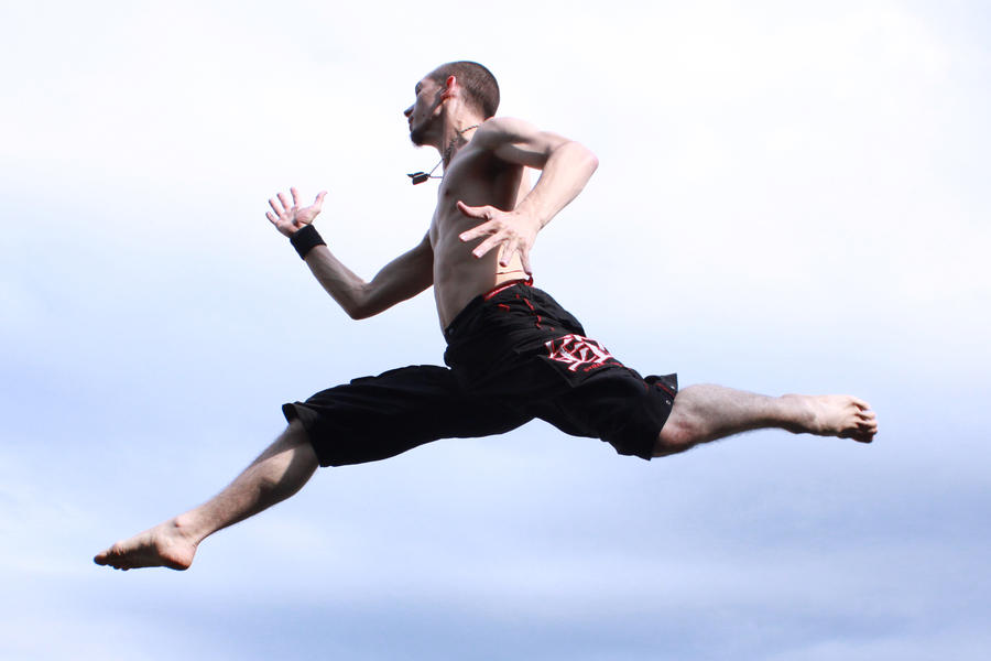
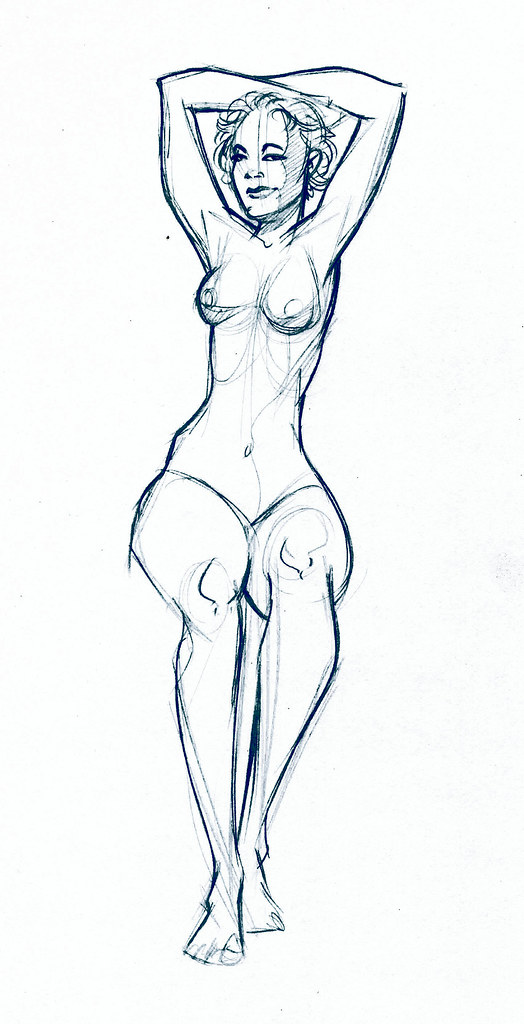
I decided to do a doodle from a stock image I found on good old Deviant Art:
 |
| My legs can't do that. |
Deviant Art is great for finding poses. This one was posted by
Danger99Stock, he has some great jump poses under his action gallery.
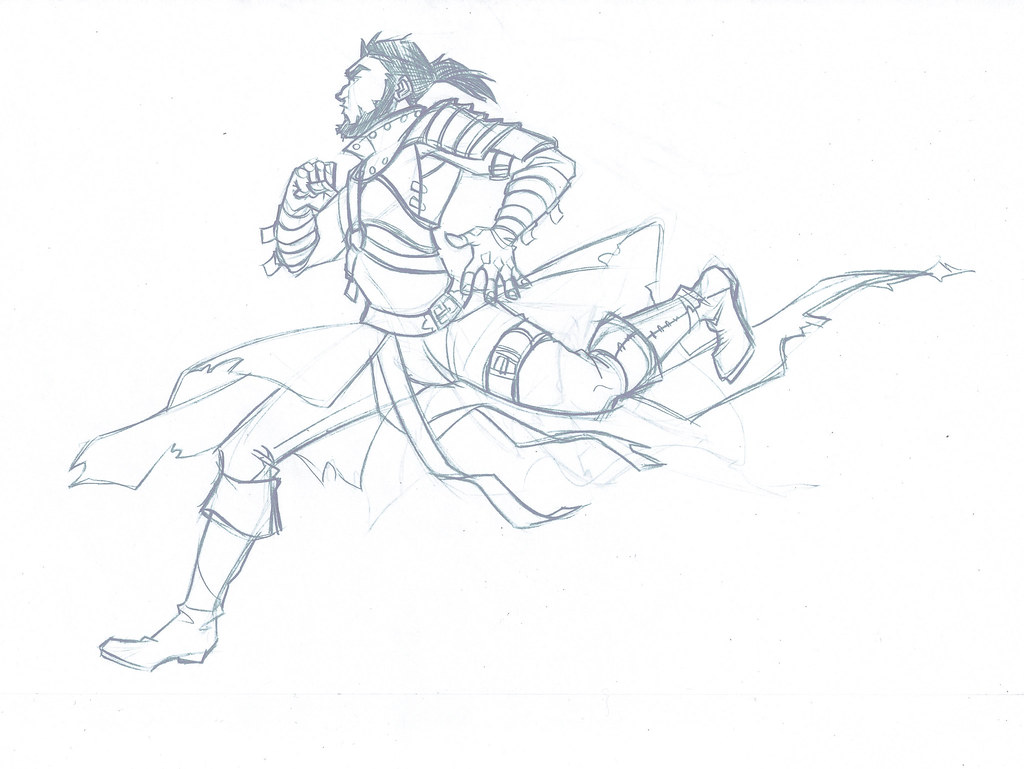
The pose is a little crazy but I think it's dynamic and fun so that was a nice starting point. I sketched it out once just to figure out what the muscles were doing and then I came out with a drawing that looked like this:
 |
| I adjusted the pose a bit, but it still doesn't feel quite right. |
|
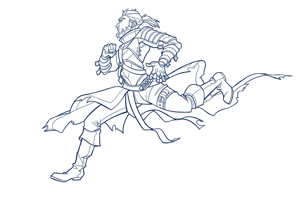
Once I scanned that in I started working on Photoshop and inked in the line work. So far it's pretty much how I normally work, nothing special. I tweaked the feet a little more trying to make him look somewhat... natural. I think it came out all right.
 |
| Let there be line! |
|
|
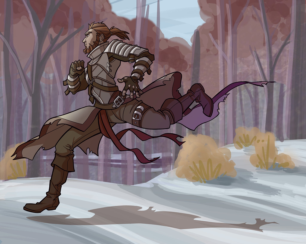
Coloring in the line work is always fun, but can be a struggle at times. I tend to desaturate a little too much, but I think that is a natural instinct in trying to prevent my drawings from looking too cute or cartoony. I also add a lot of graphic shadows, I'm hoping to improve that tendency as my digital painting skills improve.
 |
| Lookin' good! But still a little cartoony. |
So this is where I normally stop. But not today! Today is about improving. So, with tears in my eyes I grit my teeth and warmed up the Photoshop brushes. I used a number of references and a few textures, but for a short effort I think it came out not too shabby. I also threw in some gradients on the figure to give him a richer feel:
 |
| I struggled a little with the intensity of the background, didn't want it too busy. |
I ended up pulling the outline color to nearly black to keep the figure popping into the foreground. With the background I'm learning that there is a danger of making things too crazy and losing the focal point. Overall for a learning effort I think it came out reasonably well.